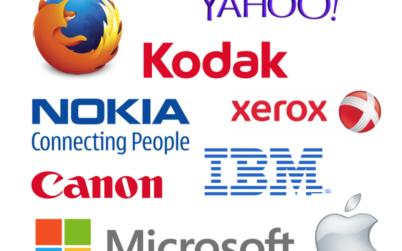
Think about the technological companies of today that produce our phones, tablets and software. You’d be amazed to see that most of them have been around for more than a century and are still leading the market.
Today we look at the logo evolution of these brands, and you’ll see how some of the original logos are hard to recognize as the familiar brands of today! Based on the video shared by the Business Insider, this article provides detailed information about the logo evolution of these technological brands.
First of all, let’s have a look at the video and discover the very first logo of these international brands:
Proven Systems for Business Owners, Marketers, and Agencies
→ Our mini-course helps you audit and refine an existing brand in 15 days, just 15 minutes a day.
→ The Ultimate Brand Building System is your step-by-step blueprint to building and scaling powerful brands from scratch.
Table of Contents
1. Xerox: A Logo Evolution That Represents a Shift in the Offering
Xerox’s business evolution
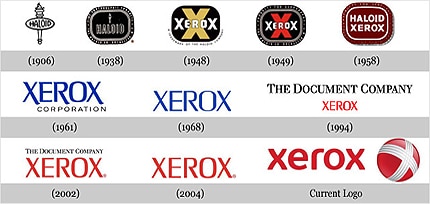
Xerox Corporation was founded in 1906 as the “Haloid Photographic Company” and started its business with the production of photographic paper. In 1958, the brand changed its name to “Haloid Xerox”, and finally became “Xerox in 1961. Today, Xerox is the world’s leading enterprise for business processing and document management.
Xerox’s logo evolution
In 2008, the brand dropped its 40-year-old logo for a new one that reflects the shift of the company from a photography and document solution provider to a hi-tech information technology company. For the first time, this logo used a lowercase font, which was used to reflect a user-friendly orientation. The red sphere next to the logo presents a white “X” that stands for Xerox. This sphere looks like a beach ball and brings a sense of fun and proximity to the brand’s image, ensuring that the new logo totally differs from the first ones that portrayed Xerox as the “document company”.
2. IBM: From Complicated Corporate Logos To a Simple Capitalized Lettering
IBM’s business evolution
IBM’s brand image has been shaped over nearly 100 years of commercializing information handling products and services. Most of the IBM’s products “were designed and developed to record, process, communicate, store and retrieve information — from its first scales, tabulators and clocks to today’s powerful computers and vast global networks” (IBM official website).
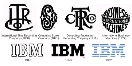
Although IBM was incorporated in 1911 as the Computing- Tabulating- Recording Company (C-T-R), its origins can be traced back to the invention of the first dial recorder by Dr. Alexander Dey in 1888. Dey’s business was acquired by one of IBM’s predecessors in 1907. In 1924, the brand was renamed “International Business Machines Corporation” (IBM) and released a new globe-shaped logo to coincide with this name change.
IBM’s logo evolution
After the globe became unsuccessful over the years, IBM chose to create a more simplified logo in 1947, using just the initial letters in a bold, understated style. The current logo is very similar to the 1947 version, and was designed by Paul Rand. The capitalized lettering shows authority, the horizontal stripes represent the speed of the company’s products and the choice of blue reflects the professionalism of the brand. The current logo hasn’t changed since 1972 and is easily recognizable over the world because of its simplicity.
3. Nokia: The Representation of Its Finish Origins
Nokia’s business evolution
Nokia is a Finnish communications and information technology company founded in 1985 that first began as a paper manufacturer. The company then invested into the electronics industry, and until recently was the leader in the mobile devices market. In September 2013, Nokia announced that it would sell all of its products and services to Microsoft and this transaction was completed on April 25, 2014.
Nokia’s logo evolution
The first logo featured a fish, which was a reference to a river called “Nokiavirta” located near the company’s offices.
Next, Nokia chose a triangular logo, which was dropped in favor of a circular black and white logo in the 60’s. That was around the time when Nokia was manufacturing electronic and cable products.
When the company started offering mobile phones, it decided to use a blue color for the font, which represented its home country, Finland. Today, the Nokia logo with the “Connecting People” slogan portrays the company’s mission, which is to connect people without barriers and distance. However, since it has recently sold its products to the Microsoft Corporation, the logo may be changing soon.
4. Firefox: The Story of a Phoenix, a Firebird and a Red Panda
Firefox’s business evolution
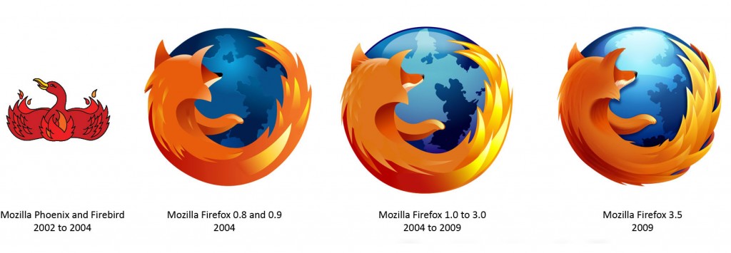
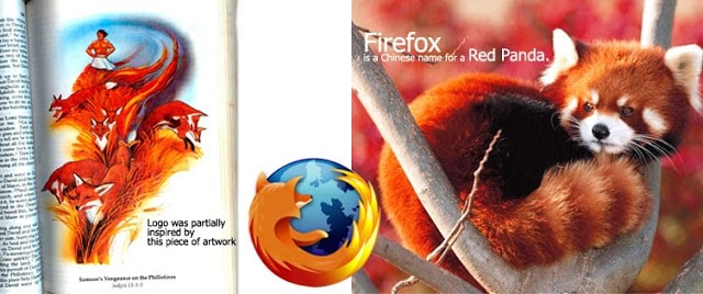
Mozilla Firefox is a free, non-profit web browser for computer desktops founded by Dave Hyatt and Blake Ross in 2002. The first name of the browser was “Phoenix”, but due to some trade name issues, it was changed to “Firebird”. The next year, the company faced a new trade name issue because of the existing Firebird database server. In 2004, the founders decided to entirely rebrand the project with a new name and logo. The new name “Firefox” is a Chinese name for a red panda. It was chosen because of its similarity to the name “Firebird”.
Firefox’s logo evolution
The first logo represents both the “Phoenix” and the “Firebird” which were first chosen as names for the brand between 2002 and 2004. Because of the name trade issues and the branding change, today’s logo is totally different to the original one and represents a fox encircling a globe.
An interesting fact about this logo is that in reality, it is not a fox but a red panda named “Firefox”. The panda’s look and posture were inspired from drawings in a child bible but also from a Japanese brush painting of a fox.
5. Kodak: Moving Towards Simplicity
Kodak’s business evolution
Eastman Kodak is a global American company founded in 1888 by George Eastman, which specializes in digital imaging, photographic materials, and related equipment and services. In 1976, the company owned 90% of the market share for photographic film sales in the US. However, since the late 1990s, Kodak has been struggling financially, mostly due to the transition to digital photography.
Kodak’s logo evolution
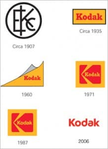
The first logo was designed in 1907 and was the first corporate logo that represented the brand’s name as a symbol. The Kodak name with its red and yellow colors arrived in the 30s.
In 1960, the brand introduced a corner curl, which was replaced by a yellow box with a graphic red “K” element inside. Then in the 80s the brand updated the same design using a different font with more contemporary lines.
Today the box is gone in order to simplify the logo, and the brand has chosen to modernize the font again, this time with rounded lettering.
6. Canon: The use of names with a meaning
Canon’s business evolution
Canon is a leading Japanese company that manufactures imaging and optical products such as cameras, photocopiers, printers and medical equipment. The brand was originally named Precision Optical Industry Co. Ltd in 1933.
In 1933, when Precision Optical Instruments Laboratory was established, the name given to its cameras was Kwanon: “This name reflected the benevolence of Kwanon, the Buddhist Goddess of Mercy, and embodied the Company’s vision of creating the best cameras in the world. The logo included the word with an image of “Kwanon with 1,000 Arms” and flames”, (as explained in Canon’s Official Website).
A year later, the company decided to expand abroad and needed a name that would be accepted and understood internationally, and so the name Canon was chosen and registered as the official trademark in 1935. Canon’s Official Website explains that “The word Canon has a number of meanings, including scriptures, criterion and standard […] And since Canon and Kwanon had similar pronunciations, the transition went smoothly”.
Canon’s logo evolution
The first two logos were inspired by the name of the commercialized cameras, “Kwanon”, and the very first logo also included the image of the goddess with her many arms surrounded by flames. Since the name of the brand was changed to “Canon”, the company has designed several versions of the logo. The unified version was created in 1953, and the logo used today was created in 1956, after several refinements.
7. Yahoo: From a Playful Font to a Symmetrical Font
The business
Yahoo! Inc. is a world-renowned American Internet services firm founded in 1994 by two Stanford University graduates: Jerry Yang and David Filo. Yahoo’s products and services vary from a web portal, search engine, email service and a web directory, amongst others. A fun fact about the brand’s name is that Yahoo is not an interjection but an acronym for “Yet Another Hierarchical Officious Oracle”.
Yahoo’s logo evolution
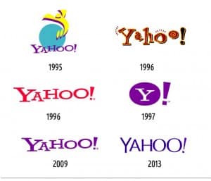
The first logo of the brand was introduced in 1995 and featured an enthusiastic figure jumping to represent the letter “Y”.
The pixelated, 90s-style red and brown logo was used very briefly during the early days of the Internet. Yahoo! quickly switched to a new logo style that most of us are familiar with, the dynamic but much cleaner font that was used until last year.
In 2013, Yahoo! unveiled a new version of its logo, which features streamlined letters with a more symmetrical font.
8. Microsoft: The Logos That Had Popular Names
The company
Microsoft Corporation is the world’s largest software maker. It was founded in the US 1975 by Paul Allen and Bill Gates. The name Microsoft comes from a letter Bill Gates sent to Paul Allen in 1975: he used the word “Micro-soft” to refer to their partnership.
Today, Microsoft is widely regarded as one of the most successful and valuable companies on the globe. The majority of its products are related to computing and the Internet, some examples are Microsoft Windows, Office, Internet Explorer and the Xbox.
Microsoft’s logo evolution
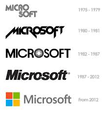
The original ‘groovy’ Microsoft logo was introduced in 1975 and reflected the 70’s and 80’s font trend. In 1980, for two years, the logo was redesigned with bolder letters.
In 1982, the company launched a new logo with a dark green background. The “O” of this logo became very famous and was named the “Blibbet. It’s been featured in the “Save the Blibbet” campaign and honored by the “Blibbet Burger” served in the MS cafeterias.
The company released a new logo in 1987 called the “Pacman” logo, which was designed by Scott Baker and emphasized the “soft” with a slash between the “o” and “s”. This dash represented the ideas of motion, speed and force.
Today, the logo is represented by four colorful squares used for the Windows logo: red, green, blue and yellow. The colors symbolize the diverse portfolio of Microsoft products.
9. Apple: Towards a Logo Simplification
The company
Apple Inc. is the one of the largest and most famous companies in the computer, software and electronic devices industry. Apple was founded by Steve Jobs, Steve Wozniak and Ronald Wayne in 1976. The company is well known for its Mac computers, its iPod media player, its iPhone smartphone and its iPad tablet. Since its foundation, Apple has remained one of the most innovative and competitive companies of the industry, constantly providing some of the best quality products in the market.
Apple’s logo evolution
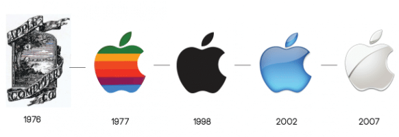
Although the current Apple logo is very famous around the world, it totally differs from its very first version. This first version was designed by Steve Jobs and Ronald Wayne in 1976 and represents Isaac Newton sitting under the apple tree with ‘Apple Computer Co.’ on a ribbon banner. On the logo, is it possible to read the following sentence: “”Newton… a mind forever voyaging through strange seas of thought”. Newton and its apple were chosen to represent the idea of science and innovation.
In 1977, designer Rob Janoff brought the famous “rainbow apple” which was supposedly designed to illustrate the company’s tagline “Byte into an Apple”. However, the designer later admitted that the bite was added in order to distinguish the apple from a cherry tomato. Since then, the logo has undergone minor modifications, from a black look, to a 3D version in blue, and finally, white.
References: Xerox Official Website, Famous Logos (Xerox, IBM, Nokia, Kodak, Yahoo, Apple),IBM Official Website, Themapr, Nokia Official Website, Maksuddot Blog, Firefox Official Website, Telegraph, Los Angeles Times, Kodak Official Website, Canon Official Website, Visual.ly, Business Insider, Tribune, Inventors.
Pictures: Xerox (seen in Famous Logos), IBM (seen in Famous Logos), Nokia (seen in Instant Shift), Firefox (seen in Maksuddotblog), Kodak (seen in Kodak Official Website), Canon (seen in RefinedGuy and on Canon Official Website), Yahoo (seen in ShiftInspire and MarissaMayr), Microdoft (seen in Karthiklog), Apple (seen in CDN Mactrast)


