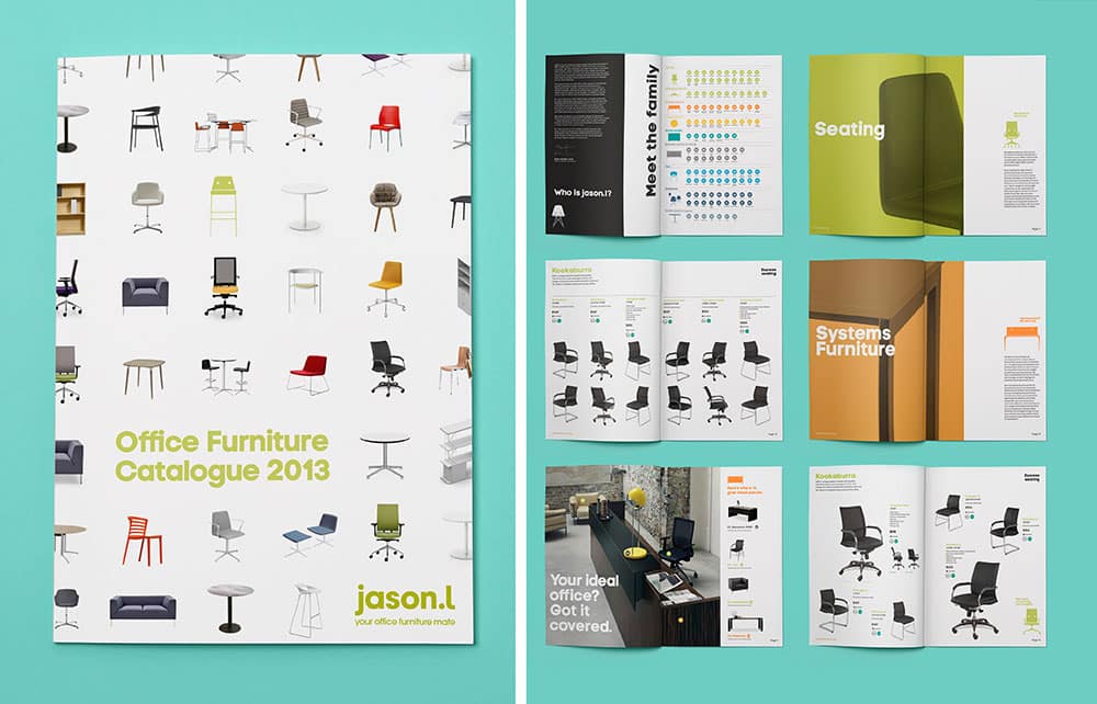
Jason.L is an Australian online office furniture retailer, founded in 2009. The brand became quickly successful, so in order to distinguish itself from the rising amount of competitors, Jason.l decided to introduce a new visual identity designed by Re from M&C Saatchi Group.
Jason.L is a company that entered into the office furniture industry in 2010, and one which has significantly grown in just a few years.
The company’s point of differentiation is to sell high quality office furniture directly from factories, avoiding retailers and agents. This strategy allowed the brand to keep prices low and grow a robust base of loyal customers.
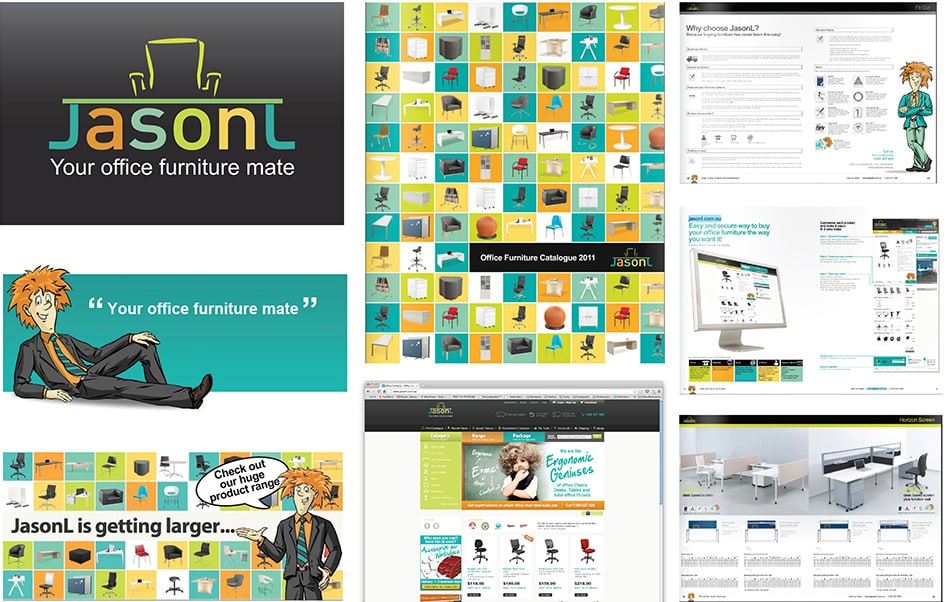
The challenge:
Within just a few short years, the company had managed to become a strong player in the industry. However, Jason.l had to face fast-growing competition, and needed a new visual identity that would elevate the brand to another level.
The main challenge was therefore to create a new identity that would improve the brand’s image and differentiate Jason.l from other competitors.
The strategy:
The rebranding strategy was elaborated by Sydney-based agency Re, which focused on creating a new visual identity in accordance with Jason.l’s brand personality. The company has indeed built its business around three main values: being friendly, upfront and helpful, as suggested by the tagline “your office furniture mate”.
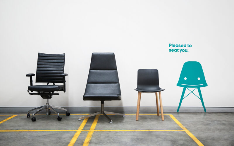
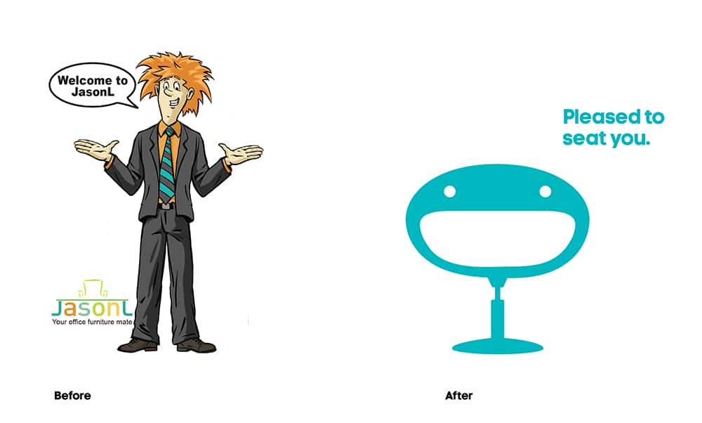
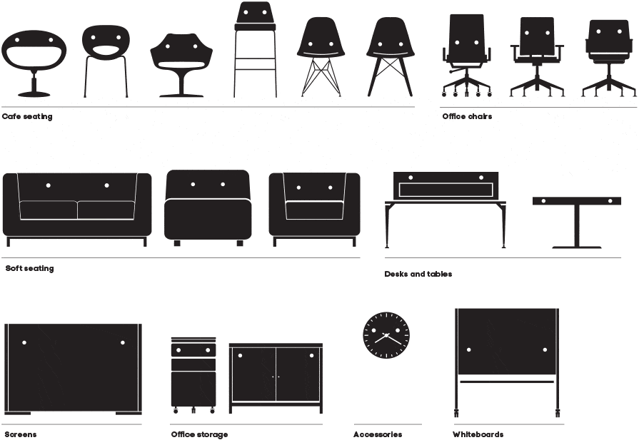
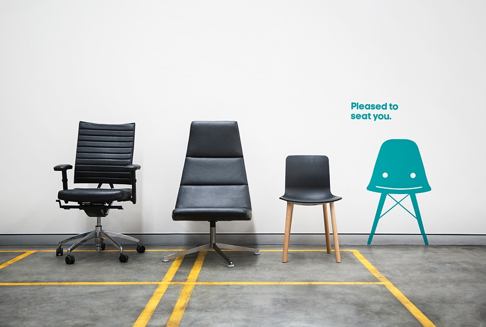
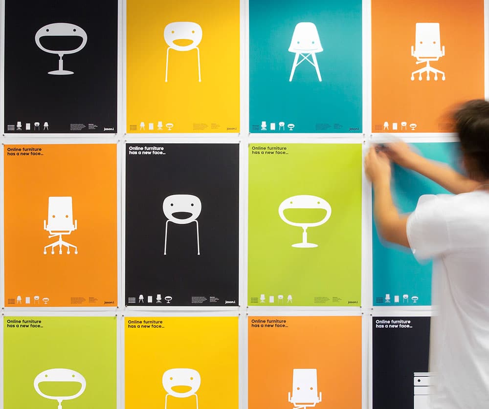
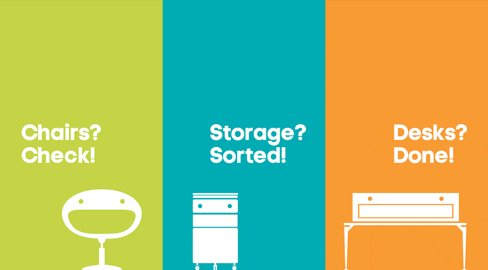
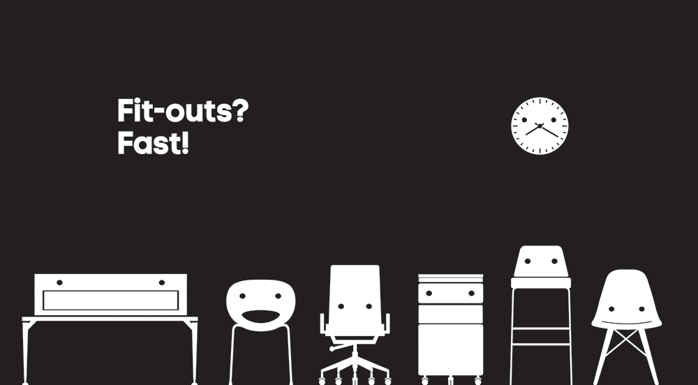
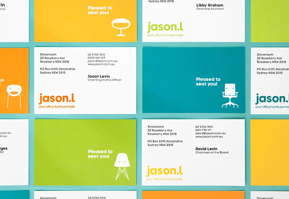
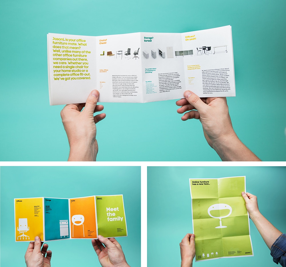
The original brand visual representation reflected the brand’s personality but didn’t mirror the established brand Jason.l has become. For instance, the original mascot was not perceived as very professional. The agency therefore replaced it with a series of modern office furniture characters with a friendly and fun attitude. “These form the basis of an identity system that not only reflects what Jason.l sells, but the way they do business – a little out of the ordinary.” (cited in Rebrand).
Along with refreshed mascots, the agency came up with:
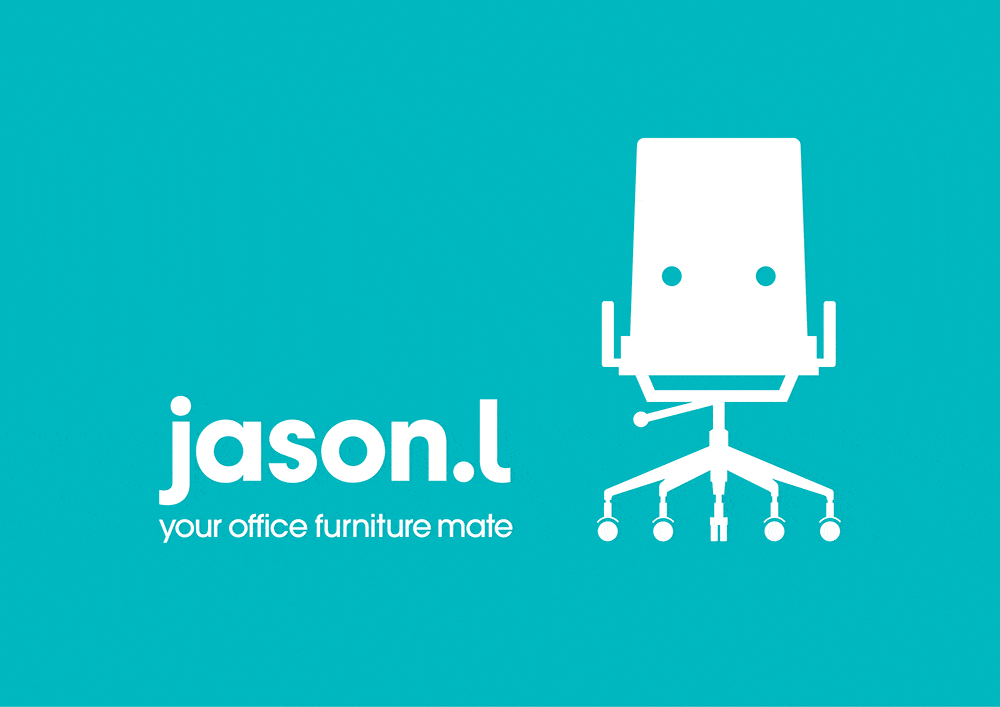
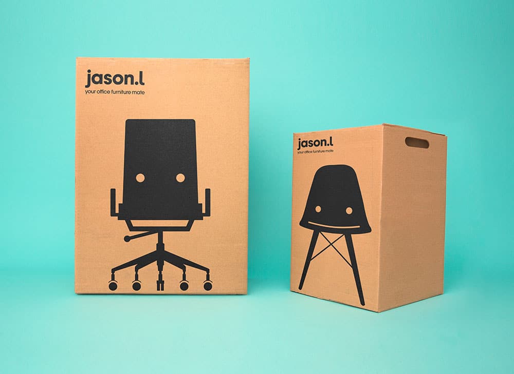
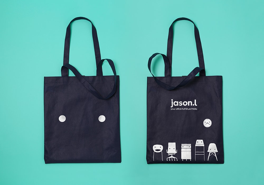
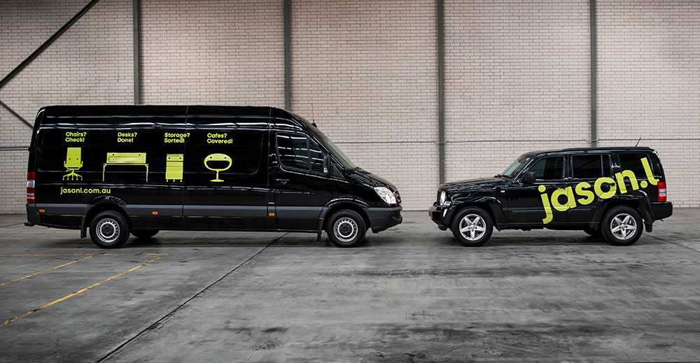
- A new logo with a curly “l” that pairs well with the initial lowercase “j”
- A new color palette, kept from the previous identity, with a fresher feel
- A modern typography that plays well with the flat avatars
- A new positive and motivating tone of voice
The results:
According to Rebrand, the new visual identity has converted Jason.l into a serious player in the Australian office furniture industry. Since its recent launch, the brand already perceives signs of growth and engagement from every stakeholder.
Conclusion:
The new visual identity establishes a distinct personality for the company in a fun and professional way. By choosing a similar color palette, Jason.l is ensuring that its consumers will continue to recognize the brand within this new visual identity.
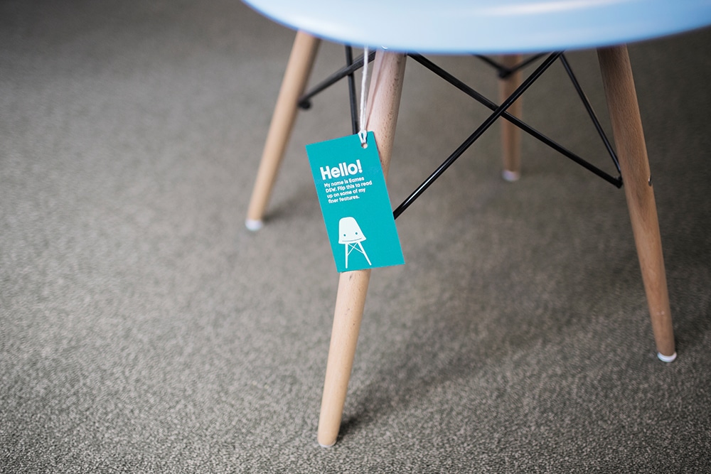
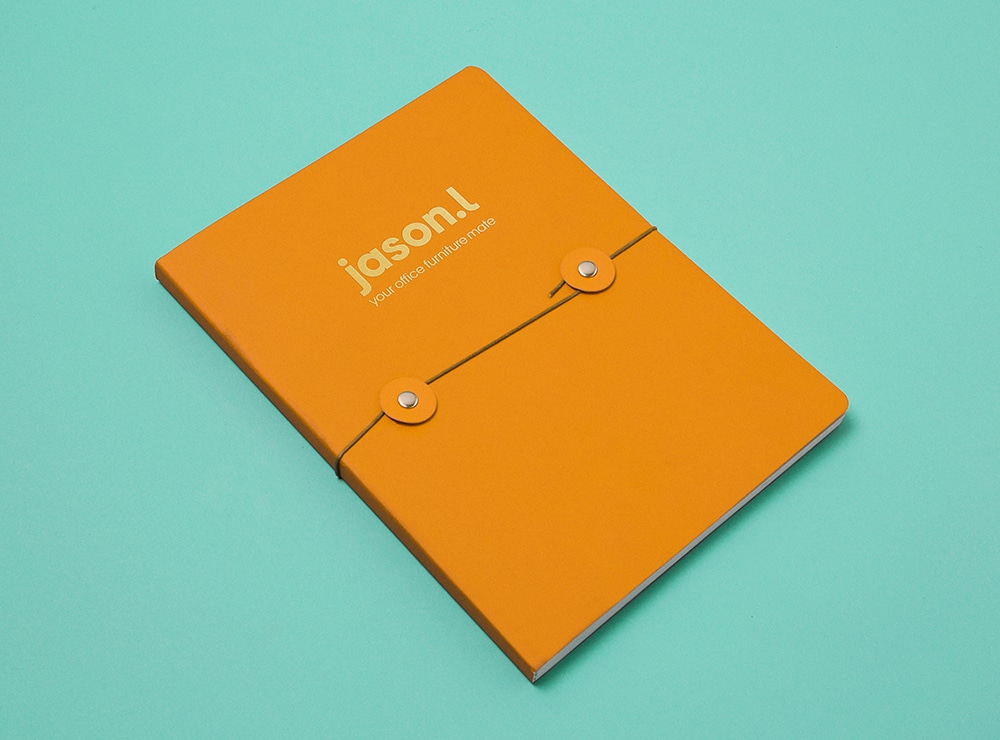
The new typography and logo reflect a modern company and go well with the new furniture mascots. Finally, the fact that the new flat mascots are present on all available brand materials (flyers, boxes, walls, website, logo, notebooks, business cards, labels, and magazines) provides a consistent and approachable touch for the company across all communication channels.
Note: This rebranding strategy was rewarded as “Best of awards” 2014 Rebrand 100. See the full list of winners here.
References: Jason.L, Rebrand, Re-blog, UnderConsideration // Brand New
Pictures: UnderConsideration // Brand New




Hi Marion,
Great article, our branding indeed is amazing and we just love it.
This year we’ve gone one step ahead and deeply integrated our new branding with our freshly designed website.
Have a look and do let us know what you think? Maybe collaborate an article for the website design?
Also, it would be great if you could add a link to our website home page so your users can see it too, add a great value to your article
Hi Dhawal! Thank you for your nice comment and congrats for the great work.
Please send me via email your website link and any images/content I could need to update the article: co*****@****************al.com
I’ll be happy to see what I can do!
Have a great day.
Good articles giving me a very nice idea thanks