Superdry is an international clothing label of SuperGroup plc., headquartered in Cheltenham, UK. This case study looks into the key aspects of branding that heavily influenced the success of this label. Also, we look at how the definition of this brand altered consumer perception.
A couple of months back, I was taking a stroll down Princes Street, Edinburgh, which happened to be the week of the Fringe Festival. Had a good time watching the acts but what really caught my attention was the sheer number of people sporting Superdry apparel.
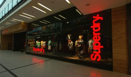
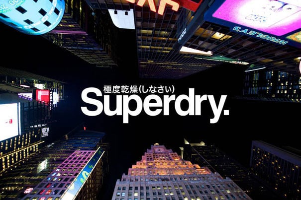
The jacket with the Japanese script lettering on its shoulder lining, which happens to be the logo as well, is a ubiquitous sight on any high street in Britain. Imogen succinctly writes in The Guardian – “in London, you are never meant to be more than 6ft away from a rat, even if you can’t see one. Today, in the UK – by my scientific reckoning – you are never more than six feet away from a bit of Superdry.

Superdry: who are they?
For the uninitiated, Superdry is a fashion label of SuperGroup plc, an international clothing company based out of Cheltenham, UK. Well, it didn’t start out that way but that’s what this case study is all about. It’s about ingenious branding that 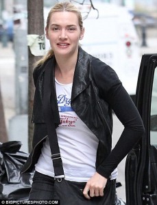
Beckham posed with one, Bieber performed with one, Helena Christensen, anyone? Yes, she was papped with a Superdry triple zip Windcheater. Oh, and did I mention Kate Winslet? You get the picture (excuse the pun). And, ironically, celebrity endorsement wasn’t initiated by SuperGroup and, yet, celebrities in Britain, and the ones across the pond endorse Superdry with their wallet, nevertheless.
Brand Identity
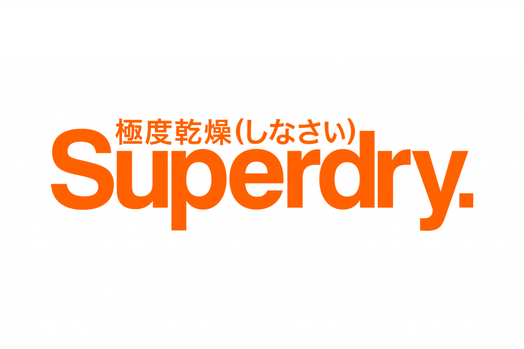
They market themselves as a “fashion chain for men and women blending vintage Americana with Japanese and British inspirations.” What’s the Japanese inspiration, I hear you ask. Well, the scripting on the logo, and, yeah, that’s about it. But, boy, did it work! SuperGroup have clearly capitalised on consumer psyche towards anything Japanese. Research has shown that European consumers aspire and exhibit inclination towards Japanese brands and this is reflected in their purchase decisions. Moreover, packaging/products scripted in Japanese tend to exude a certain degree of quality and “wow” factor in the customer’s perception.
The fact that Superdry has nothing to do with anything remotely Japanese is evident if you decipher the script. If loosely translated (there’s no literal translation from Japanese), it reads “maximum dry (do)”, which sounds absolutely nonsensical. James Holder, the brainchild of Superdry reminisces of his obsession with typography and his childhood spent reading Japanese manga comics (known for its Japanese script on the cover). Apparently, the logo was conceived at a Japanese pub by James with a play on English and Japanese typography to loosely convey the meaning of staying dry on a wet day using Superdry.
The branding genius lies in the logo seamlessly incorporating Japanese and English, and conveying something totally different to what it actually says! Some market experts believe it’s a parody on Japanese clothing brands that often use meaningless English mumbo-jumbo to appear British. Parody or not, SuperGroup ain’t complaining. The logo has elevated Superdry to the point it’s mentioned in the same breath as Uniqlo, Zara, AllSaints and Mango – labels that rub shoulders with Superdry.
The Road Ahead
As is usually the case with brands that solely rely on brand identity, Superdry has reached a plateau, in terms of its “über-cool” appeal. With brand fatigue setting in, SuperGroup badly needed to infuse some pizzazz into the flailing brand. Well, hope has come cloaked as Idris Elba, yes, “The Wire” man, who’ll be lending his name for a premium range of Superdry apparel, apparently.

The name “IDRIS” has been trademarked and this time (thankfully!) there’s no Japanese script tag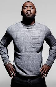 ging the name. The designers have adopted a rather conservative approach with the new logo, perhaps to appeal to a more mature audience.
SuperGroup hopes Idris’ mass appeal will help gain lost momentum both at home and the US, one of Superdry’s biggest markets. According to a report in The Guardian, Euan Sutherland, the chief executive believes “Superdry still appealed to 18-24 year old market, but many shoppers had grown up with the brand” and Elba, 42, would appeal to that older generation as well.” Further, he adds, “Idris Elba is a big man in the US and he will automatically reposition Superdry in people’s minds.”
It’s not the first time that Superdry is betting big on celebrity endorsement. It’s always thrived on celebrity endorsement. Now, though, SuperGroup’s taking it a notch further by launching an entire sub-brand that is Idris Elba. This strategy has worked in the past for many high street brands to plug plummeting sales. Will this work for SuperGroup? What do you think? Would love to hear your thoughts.
References: The Guardian; Rooms14menswear.
Pictures from: ManchesterFashion; Pinterest; Dailymail UK, Superdry.com


Cool article! I’ve always kinda liked their branding, even though the japanese text is gibberish. It has this clean, sleek air to it that a lot of helvetica-sporting material design/international design/swiss style logos are coming back to in this digital age. Frankly, I didn’t know it had gotten so popular.
Thanks For Sharing!
Thanks for giving insight of this.I appreciate how you look things
Very good article, thanks.
You really didn’t mention the fact that Superdry’s logo font and color are so much alike to “Supreme” brand?? Apart from the Japanese whatever, aren’t consumers being lured in because Superdry gives them the perception of buying a brand associates with Supreme or simply a very exclusive and expensive brand at a mundane price??