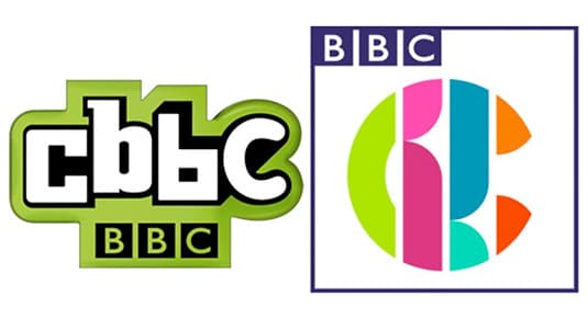
For the first time in ten years the popular children’s TV channel, CBBC, has changed its logo in an attempt to make it more modern and fitting with today’s media age. But what do the logo designers of the world think about the new look and most importantly what about their biggest critics – their target audience themselves.
1) New logo unveiled

The new CBBC logo (designed by Red Bee Creative) is very colourful and seen as more versatile and more fun in its appeal. However, it also doesn’t explicitly say CBBC and according to some critics doesn’t exactly “scream children’s TV” but has been designed similar to the new look BBC3 logo to be more adaptable and fitting with todays’ media age.
2) Why the need for change?
The old CBBC logo hadn’t been adapted or modified in ten years and for all recognised it felt like it was a little outdated. Of course with everything moving online and with more and more switching to digital, Controller of CBBC, Cheryl Taylor commented “Our job is to keep one step ahead of this agile age group – celebrating their immersion in all things digital whilst maintaining all the CBBC qualities that we know our viewers love. We’ve worked hard to ensure that our content does just that – reflects our audience on all our platforms and is ready for action when and how they want it. Our old logo just wasn’t devised to perform in a variety of digital spaces which means that it doesn’t work in the way that we want it to today”.
3) Does it work?
Opinions are mixed. From the design community there has been some negative reactions, linking the new logo to W1A, negative comments regarding spacing and referring to it like a modern day Pac-man.
Can the BBC PLEASE hire a graphic designer with a basic understanding of spacing? This CBBC rebrand is horrific… pic.twitter.com/J8w998NRMD
— Emma (@emmadotswanson) March 14, 2016
I absolutely love the new @cbbc logo @CBBC_Hacker it’s colourful, clean and a little bit Bauhaus! pic.twitter.com/rpNgYRRpY6
— Ric Leeson (@TrickyDTritch) March 14, 2016
However, it’s not all negative, with some designers commenting they like the clean, fresh approach, especially commenting on the use of colour.
We agree that it doesn’t scream Children’s TV, but what it does do is sit nicely under the BBC branding umbrella, so the quality kite mark is there.
The use of colour is very appealing for the target audience in which they’re aiming this channel at and because of the difference from 2 colours in their old logo to a mix of colours – they have used the psychology of colour to strengthen their brand image in this area. Plus due to the flexibility in the design this logo is more adaptable for online and offline products/promotions so again can become more appealing to a wider age group.
4) Rebrand at its best
Not only did the CBBC change their logo but they made sure they incorporated the opinions of their viewers and they continued to involve them in every stage of the process, even down to re-designing the CBBC office! This is a great strategy because they made their audience feel part of the bigger picture, their involvement encourages commitment and loyalty to a brand that they feel they have helped create. Brand loyalty is a big factor for any company’s overall brand strategy and including your target audience in parts of the decision making process can only have a positive effect in the long term.
References: Creative Bloq, The Guardian, BBC Blogs
Pictures from: Creative Bloq, Under Consideration


