Instagram have decided to revamp their logo to make it a sleeker looking app and more fitting with the internet age. But opinions are mixed as to whether the new logo represents the company and their brand – or if truth be told does it simply looks like another Apple icon?
1) The change
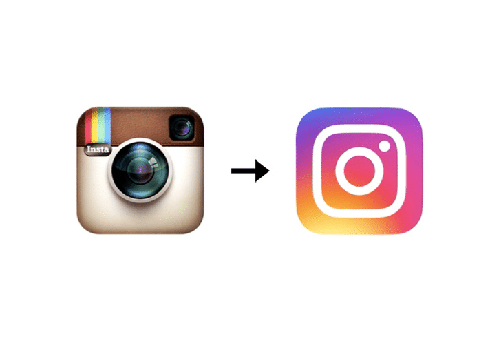
Moving away from the vintage camera style icon the brand had created 5 years ago, the new logo is a sunset of colours, with simply a white outline of a camera. An outrage to some, who believed the unique stand out style of the original logo, was distinguishable and perfectly represented their vision for where the brand wanted to be positioned.
The new range of colours and the new design layout has been described by The Guardian “as if the camera was murdered, and chalk was drawn around its body. Murdered at sundown”.
Yes maybe a little bit extreme but in a sense it does perfectly describe the use of colours and the new outline drawing of the camera…
2) The reason why
Instagram were in a tough position as their logo did need updating and to be honest it did need to change. The classic and in some senses, old fashioned, logo just didn’t fit with the internet age or the creativity and image of the brand now.
When Instagram first launched it was about focusing on giving photos a vintage feel so of course the original logo of the leather clad camera was suitably apt.
But society has changed and it has changed fast (just like technology doesn’t stand still, neither does your audience). Instagram grew to a point where brands, celebrities and a younger generation were now using it as their social media of choice next to snapchat and Tumblr.
Vintage all of a sudden became redundant and the visual identity of the company no longer matched its brand position – hence the need for change.
The new logo does cater to current web aesthetics but maybe an Apple looking, sun blast of colour was a step too far?
3) Not everyone dislikes it!
For all opinions are mixed on the logo, for the design community it has been well received. Mainly for its simplicity and “fit” for the target audience.
According to Instagram’s own blog post on the logo change “the Instagram community has evolved over the past five years from a place to share filtered photos to so much more – a global community of interests sharing more than 80m photos and videos every day. Our updated look reflects how vibrant and diverse your storytelling has become.” – As an aside, I love the fact they have brought the audience in by simply using the words “your storytelling”.
4) More fitting?
The jury is still out on this one. The rationale behind why they’ve changed of course makes sense, they want their brand to be reflective of the digital era and even incorporate this into a small thank you message to users, when users update the app “Thank you for giving this community its life and colour”.
So yes the communications fit with the colour theme but personally it still has the link back to the original logo and bringing things to life.
From a brand perspective it doesn’t seem to fit with their values from when they first started in 2010, the brand story seems to be a little distorted now and a new one needs to be almost created.
They also need to think about how they have associated, even inadvertently to another brand such as Apple, by the use of colour choice. The good news is they haven’t thrown out everything and as we can see in the new logo there are still elements of the old – it’s simply just the use of colour that has been so bold that has created a shockwave in the industry.
However, it is the original identity and brand story which helped to push Instagram into one of the top all time apps and grow its consumer base to millions in such a short space of time – it will be interesting to see Instagram’s reaction to such negative social media attention it is now receiving, watch this space.
References: The Guardian, Forbes
Pictures from: Social Media Archives, Forbes, The Guardian


