Apple are renowned for being different, for having the stand out, simple yet effective visual identity. Their retail stores have always aimed to offer their customers the Apple experience, but now Apple is aiming to change the face of retail with its new flagship store opening in San Francisco this week.
1) Changing retail ways
In any Apple store all over the world, you can walk in and try any of their products before purchasing. It was a new concept when it was first introduced – customers were actually able to see if they liked what they saw and used, before making a decision!
It was as if Apple had become a fashion label that you tried on to see if it suited you before you purchased it. It was making a brand statement and changing the way people shop for devices like this.
2) The Store
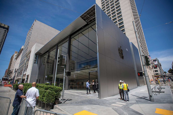
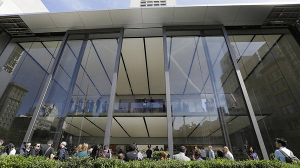
Following in the footsteps of New York’s Fifth Avenue store, the new store aims to carry on the sleep look, with glass walls and 43-foot doors which open 40 feet wide, welcoming visitors into their space.
With Apple products on display in areas all clearly defined using branding tools, which is where Apple work their magic and the brand ambiance takes over.
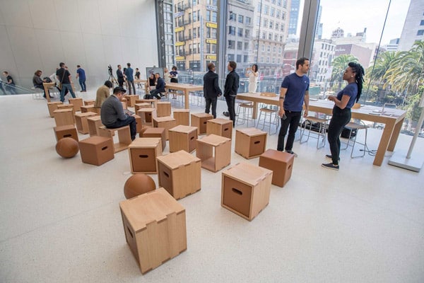
- The Avenue, where Apples’ products are lined up as if in window displays
- Genius Grove, which replaces the Genius Bars of old Apple locations
- The Forum, which has a 6K-resolution 35-foot video wall and features in-store programming from artists, photographers, musicians, etc. as well as video-game nights and music-video premieres
- The Plaza, an area open to the public 24 hours a day that has Wi-Fi and occasional performances
- The Boardroom, a space where local entrepreneurs and business customers can receive training
According to Angela Ahredts, Apple’s senior vice president of Retail and Online Stores, “We are not just evolving our store design, but its purpose and greater role in the community as we educate and entertain visitors and serve our network of local entrepreneurs.”
3) The power of brand
What Apple are able to do is bring their brand to life through their stores. Everything they say their brand is and stands for, they aim to make sure that this is felt when a consumer walks through one of their shop fronts.
The glass panelling in particular, is appealing because in Apples’ own press statement they make the comment about transparency and almost like the brand has nothing to hide, it is now visually represented with their glass fronted stores.
Of course all of the hype and build up to the opening of the new store couldn’t have come at a better time for Apple – as it currently sees iPhone sales slowing and we haven’t seen any new pieces of innovation from the company to turn this around.
A clever piece of marketing whilst also instilling their brand image and values – clever Apple!
References: Brand Channel Apple
Pictures from: Brand Channel Wall Paper Cave


