The big financial services organisation, MasterCard has made the decision to refresh their logo after 20 years. MasterCard has made the decision to change their brand mark to reflect their increasing global reach and to fit more appropriately within the digital space.
1) The new MasterCard logo
MasterCard’s brand mark has been adapted slightly over the years to get to the stage it’s at now. It has enabled them to create a strong brand identification, strengthen their brand globally and build on the brand’s image through ongoing communications.
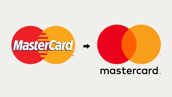
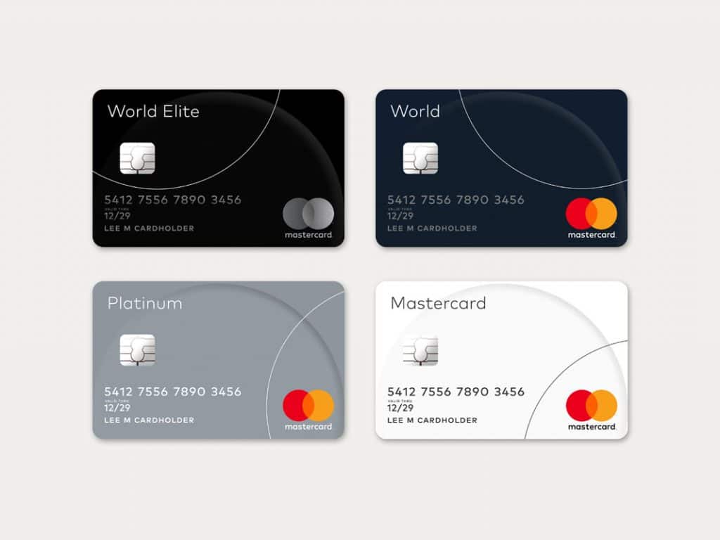
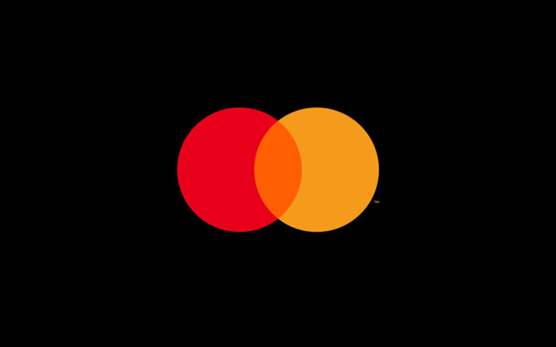
The good news is the new logo has not changed entirely. It still has the interlinking red and yellow circles (showing their connection, unity, togetherness) but all of the elements are seen to be slimmer, flatter and overall less fussy, with the name underneath the two circles.
The main change is in the way in which the name is now written “Mastercard” without the capitalised “C” and in some instances, even just “mastercard” all in lower case.The idea behind this strategy is to give less importance to the word “card” as today it’s just one type of payment amongst other digital payment solutions.
2) A hard sector
There is a lack of trust for financial services firms and especially those of lending firms. So consistent brand messaging and visual identities is the “safe” option for many of these institutions. It helps them to build trust with their audience.
But sometimes without these changes, like all companies, brands can become stuck, known for one thing and one thing only. A rigid visual identity did not reflect all in which MasterCard had to offer – the branding wasn’t flexible enough to be adaptable across a number of platforms.
Quoted in Wired, Ciny Chastain, head of MasterCard’s customer experience and design commented, “It needs to thrive in the digital space. It’s simplified. It’s modernised and optimised for relevance in an increasingly digital world”.
3) What’s the point of changing a successful logo?
That’s what we expect many of MasterCard’s customers to also think! MasterCard of course carried out rigorous research to find that it was actually the circles which people identified as their brand. It was the red and yellow that were recognisable and stood out for them.
So armed with this information the mark could be altered slightly to meet their new purpose and fit in line with their overarching strategy.
Quoted in AdWeek,MasterCard CMO Raja Rajamannar said “The MasterCard logo is recognized universally. There are 2.2 billion cards that carry the MasterCard logo. There are tens of millions of merchants worldwide that carry the MasterCard logo at the point of sale. The key for us is the equity in that logo—we have to leverage that going into the future. We had to retain the most recognizable elements of our brand, which are the interlocking circles, the red and yellow colors, and the name MasterCard itself. That’s exactly the path we’ve embarked upon.”
4) A more flexible brand mark
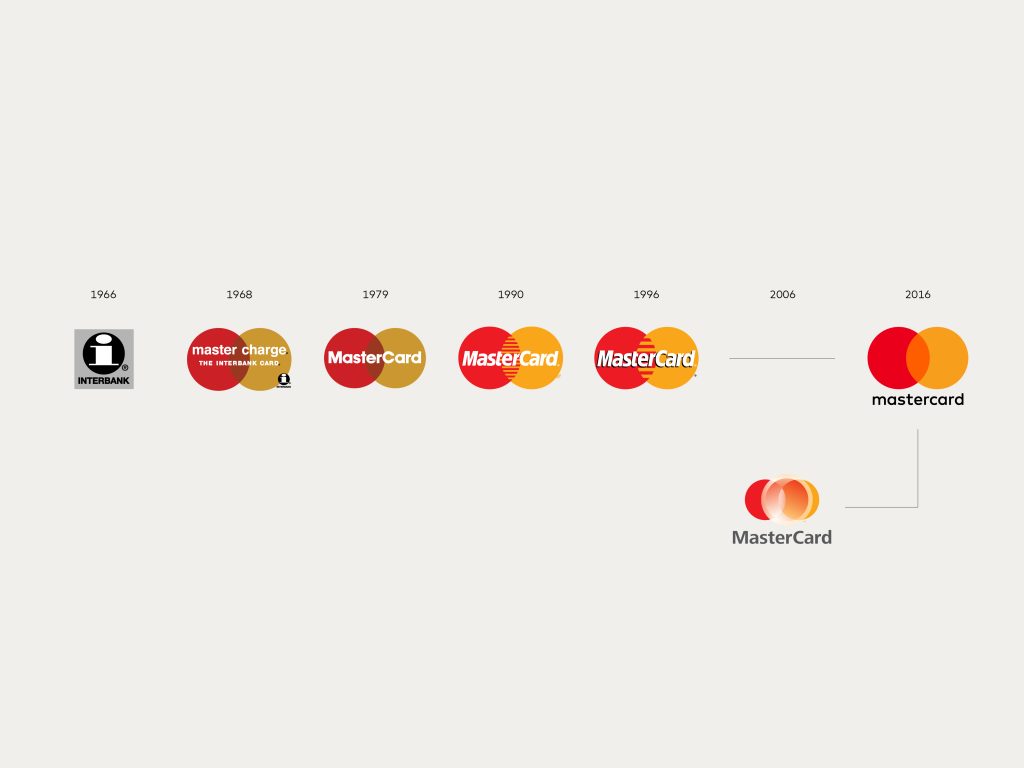
The design of the logo has been supported by their heritage and “brand story”. For MasterCard the circular elements date back to 1966, the lowercase letters from the 1968 Master Charge logo, the vibrant colour palette of the 90’s etc.
The designers and the team involved have cleverly crafted a new logo with rationale and a story behind it. It hasn’t simply been a change for changes sake. Audiences will be fed this information and communicated to so they also understand and their loyalty to the brand remains.
5) Will it work?
Well with all big logo changes there of course has to be a bedding in period. For MasterCard it is a risky move.
Personally, I like the simplicity of the design, the modern look is fresh and feels much more suitable to the digital age and generation. Compared now against its older previous logos, they do look old fashioned and out of date which for a growing brand is not something they want to be seen as.
It will be interesting to see if their communication style changes to reflect this more simplistic styling.
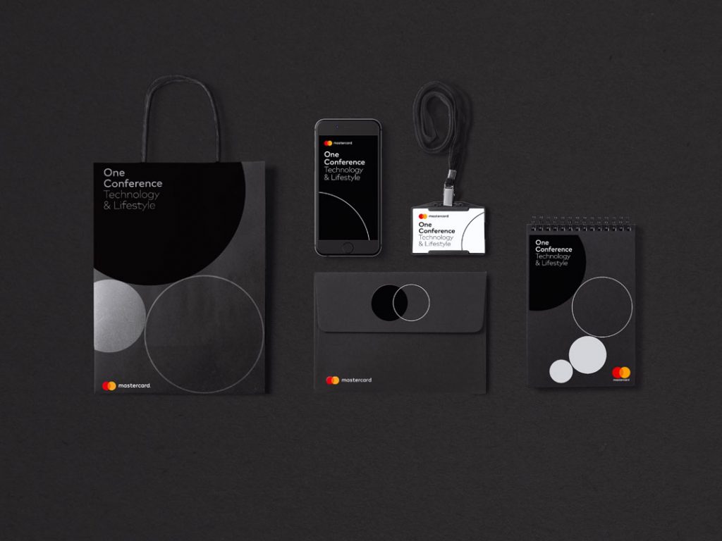
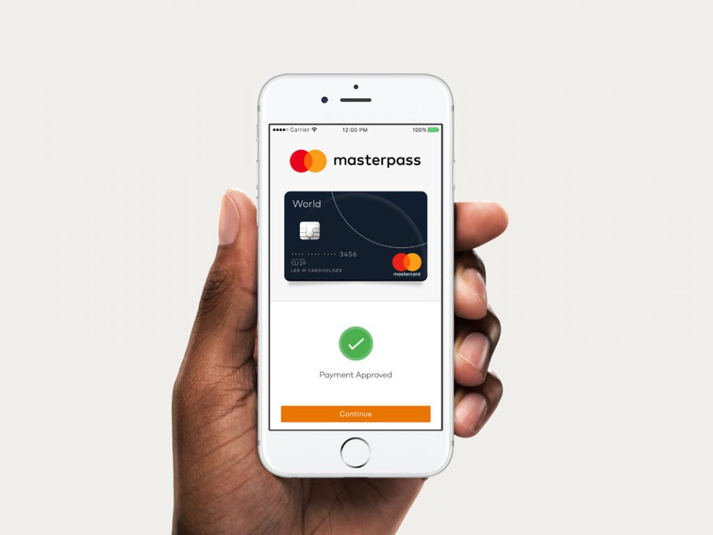

References: Wired.com, MasterCard Brand Center, AdWeek
Pictures from: CreativeReview.com




They say every fashion repeat after 3 decades. I think design team behind Master Card logo stick to that strategy. :)