The Italian notebook maker is celebrating their creativity with the smell of coffee as they extend their brand into a new market.
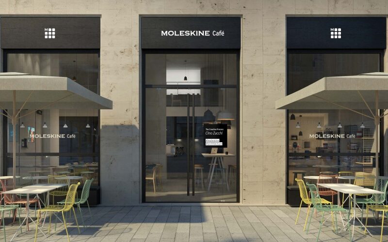
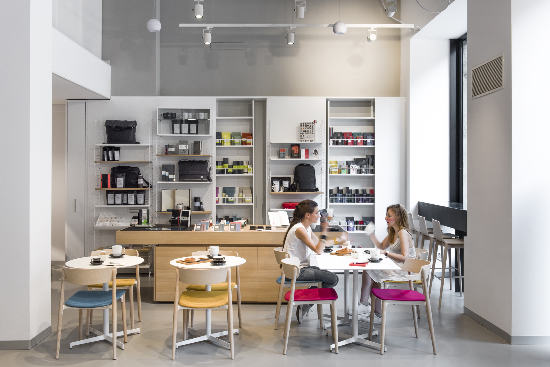
Already making headlines, the new Moleskine Café, based in Milan, aims to provide a space for creativity and relaxation.
Proven Systems for Business Owners, Marketers, and Agencies
→ Our mini-course helps you audit and refine an existing brand in 15 days, just 15 minutes a day.
→ The Ultimate Brand Building System is your step-by-step blueprint to building and scaling powerful brands from scratch.
Table of Contents
Building on their brand
Since 1997, Moleskine notebooks have established themselves as the premier journal of choice amongst creatives. They have dominated the sector not just in Italy but around the world.
This month, they built on their name and reputation to open the new Moleskine café in Milan.
Brand extension: the new café
Working with popular brand consultancy Interbrand, the café was built and designed with creatives in mind, with a strong focus on the Moleskine brand and what it stands for.
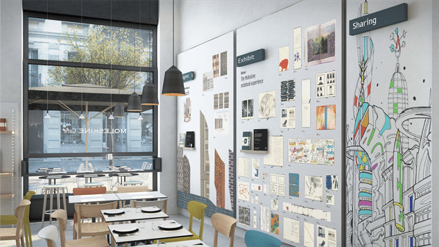
They wanted to focus on their target audience and provide an ambiance that suited their needs and mood. For example, the space is divided into a dining-working area complete with a communal table, a retail area (of course selling Moleskine merchandise), and a gallery exhibiting work from select artists and designers, as well as crowd-sourced from fans of the brand through a digital interface.
They are always linking the brand extension back to their current customers. They want to create a place where customers can relax, create, and immerse themselves in everything Moleskine.
Natural evolution
Moleskine has long promoted its brand values and strategy of creating content and building shared cultural experiences.
So, while this is a new sector for Moleskine, it is actually perceived as a natural evolution—which is a great position for any brand.
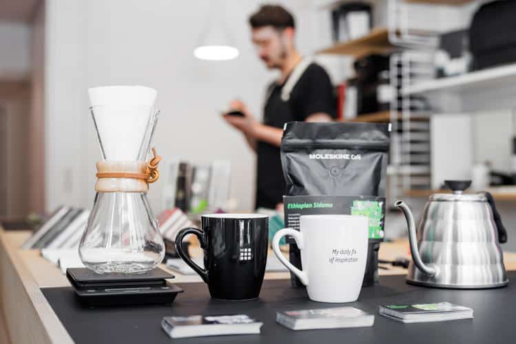
They’re also leaving nothing to chance. For example, the café channels the clean aesthetics of the Moleskine notebooks. Orders are, of course, taken in a Moleskine notebook. The placemats have been designed visually to look good enough to write on, and the Moleskine branding and logo are even extended onto cups and coffee bean bags.
Full potential of the brand
The creative team is trying to communicate the incredible story behind the Moleskine brand perfectly. Commenting on Creative Blog, Arrigo Berni, CEO of Moleskine, said, “This is an important new step in our journey to realise the full potential of Moleskine as the lifestyle brand of the Creative Class!”.
“Our vision for the Moleskine Café is exciting and unique. We will provide our guests with an innovative retail experience, bringing the socialising dimensions of food, creativity and shopping to a single space designed to reflect the distinctive, clean aesthetics of Moleskine.”
“The main challenge in building Moleskine is keeping the right balance between protecting the brand values and growing. You want to develop the business and the company, but at the same time you have to be careful. There’s a risk of diluting the brand if you don’t respect authenticity”.
Good move?
Some brand extensions fail, and they fail miserably. For Moleskine, currently, they’re doing everything right. They not only piloted the idea of a Moleskine café first in Geneva airport, but they are also presenting and communicating a clear focus on their brand. Again, Berni commented, “We’re focused on making this work (before expanding). I don’t want to jinx it.”
The same brand values apply. The company’s creativity is still central. The thought and uniqueness that have gone into making sure that the café also represents their notebooks is incredible.
However, there is significant brand recognition for their Moleskine products. Furthermore, for its loyal customers, it is seen as a brand that goes above and beyond to offer them that little something extra.
But, I do wonder if they will struggle to attract new customers or expand their target audience. Their communications and branding strategy seems to focus very much on what they currently have, making it the “right” fit for the creatives.
In this sense, are they missing out on a much wider audience?
References: Creative Blog, FastCoDesign
Pictures from: DesignWeek.co.uk, PasteMagazine.com, FastCoDesign.com, Moleskine.com


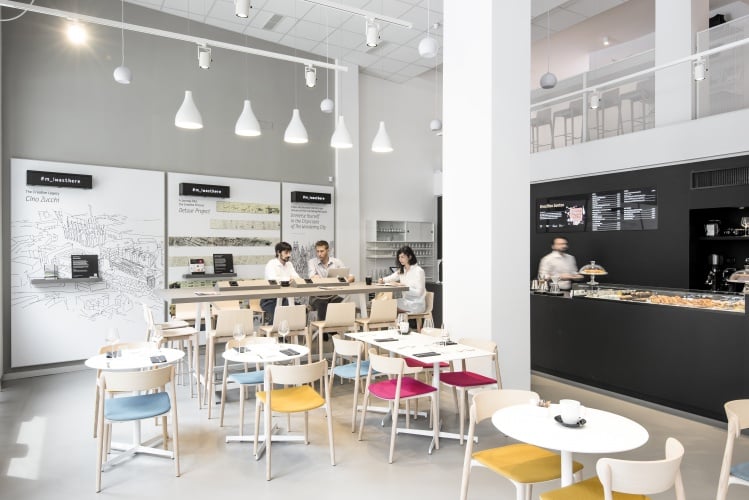




The design of the cafe seems to be too minimal to get into creativity as is the purpose of the cafe. Something more quirky and unique as a moleskine diary of various people like designers, artists and random things people do if that would have been the theme …it would have become a more inspirational and something that would intrigue a person to create.