Starbucks is one of the most recognizable brands in today’s world. With 52 years of history, the company has established itself to dominate the coffee industry with more than 35,000 stores worldwide.
Starbucks has shown that a well-established brand comes hand in hand with a great logo. This case study will examine the history of the Starbucks logo, its development, and its meaning to understand the company’s success better.
Proven Systems for Business Owners, Marketers, and Agencies
→ Our mini-course helps you audit and refine an existing brand in 15 days, just 15 minutes a day.
→ The Ultimate Brand Building System is your step-by-step blueprint to building and scaling powerful brands from scratch.
Table of Contents
Starbucks Brand Heritage and History
Founded in 1971 in Seattle by Jerry Baldwin, Zev Siegl, and Gordon Bowker, Starbucks started as a place where people could buy coffee beans, coffee-making equipment, and spices. These three friends wanted a friendly space for coffee lovers to meet and enjoy a nice cup of coffee.
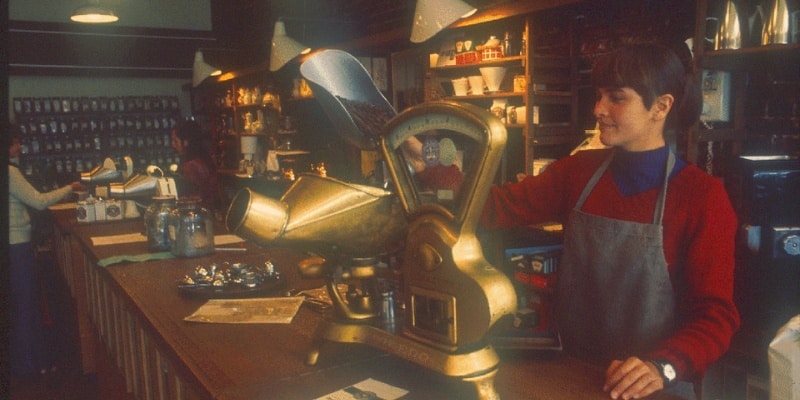
In 1983, Howard Schultz, an employee of the Starbucks shop, discovered the espresso coffee while on a trip to Milan; this moment would revolutionize coffee in the United States.
When he returned to Seattle, he envisioned revolutionizing the American coffee industry by introducing espresso on Starbucks’ menu. He wanted to differentiate Starbucks’ coffee from the regular “cup of coffee” everyone asked for elsewhere. Schultz also wanted to create a ‘third space’ in peoples’ lives, somewhere aside from their homes and workplace to gather and frequent where they will form connections. He wanted Starbucks to be more than just a cafeteria; he wanted the chain to be part of people’s every day.
The 1990s were Starbucks’ era of expansion. Throughout the decade, the company went public. It opened its first stores in Japan, Europe, and China, which could only foreshadow the importance that Starbucks would achieve in the following ten years.
Today, the company is present worldwide, dominating the takeaway coffee industry and even generating its own jargon for products. For example, naming their products ‘Frappuccino’ or ‘Cloud Macchiato’ and sizes like ‘Venti’ or ‘Grande’.
The Starbucks Logo Evolution
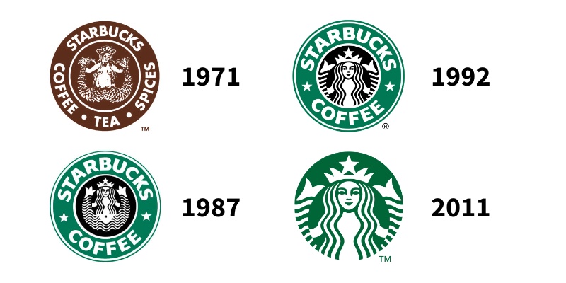
The Starbucks logo has a rich history and has undergone several changes since its inception.
1971 – 1987
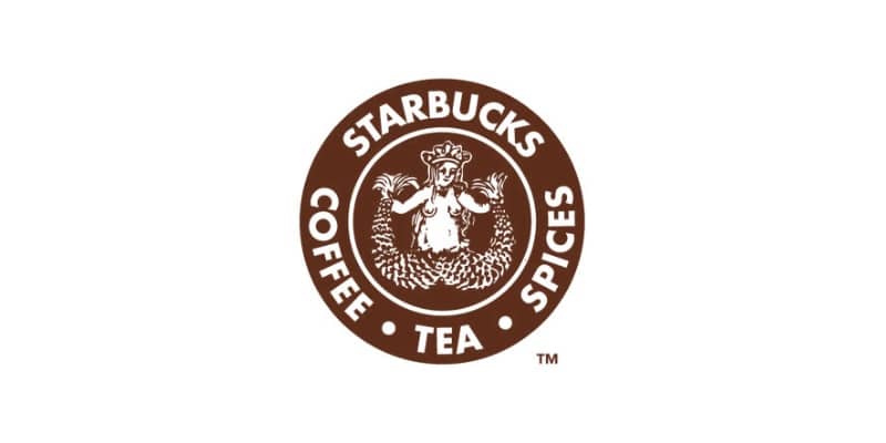
In 1971, Terry Heckler, a graphic designer hired by the founders, designed the company’s first logo.
Heckler got inspired by a 16th-century Norse woodcut of a mythical sea creature – a siren. The drawing represented a topless siren holding two tails in her hands.
The symbolic green that is renowned today was nowhere to be seen on this first logo, as brown was the protagonist. In addition, the original logo included the words “coffee, tea, and spices”.
1987 – 1992
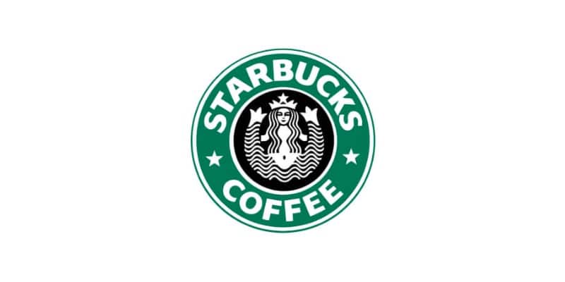
Starbucks underwent a significant rebranding effort during this period and updated its logo. The new logo still featured the siren, but she was now dressed and more conservatively depicted, with her nudity covered by her hair. In addition, the words “tea and spices” were removed due to the company’s focus on coffee sales.
However, the most significant change was the shift in the colors. 1987 saw the appearance of the infamous “Starbucks green”, a result of the merging of Starbucks and coffee company Il Giornale’s logos. This union also gave the two stars on each side of the logo.
Background: Why did Starbucks merge with Il Giornale?
In 1985, Howard Schultz left Starbucks to start Il Giornale, influenced by the coffee culture in Milan. Starbucks was Il Giornale’s first investor, and the coffee shop chain used Starbucks beans for their drinks. In 1987, Starbucks’ founders were interested in selling the company. Howard Schultz raised $3.8 million to acquire the assets and renamed Il Giornale to Starbucks.
1992 – 2011
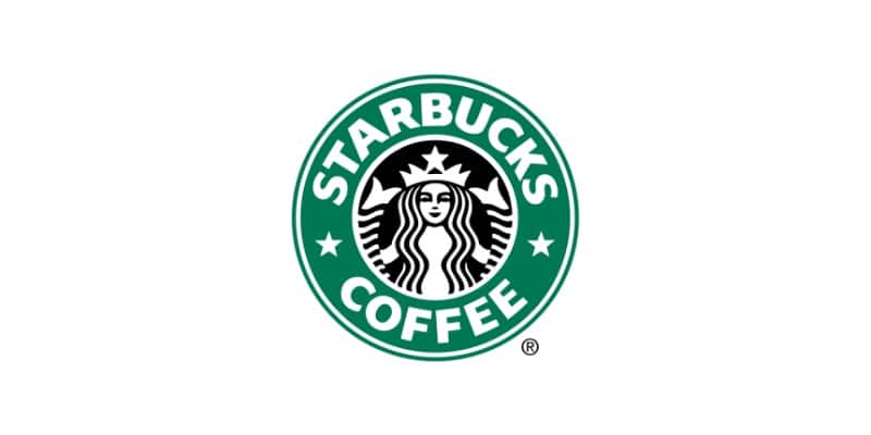
As mentioned earlier, the 1990s were the decade of Starbucks’ expansion; therefore, the company decided not to change much of the previous logo to keep its familiarity.
After a light redesign in 1992, Starbucks’ logo remained almost the same. The only significant difference was the new close-up of the siren; her whole body was no longer visible, with her torso covered by her hair.
2011 – Present
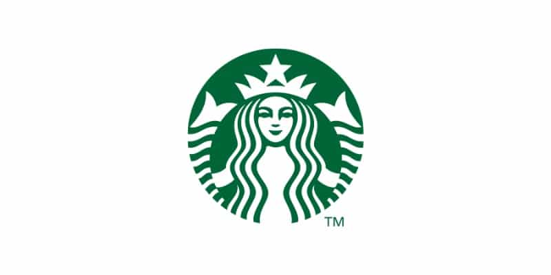
In 2011, Starbucks underwent its most significant logo change to date.
The company removed all lettering from the logo and opted for a simple, stylized representation of its siren. The new logo was designed to be more versatile and to work better in digital and mobile contexts. Moreover, the green color was brightened and made more vibrant.
In this version of the logo, the designers worked on a hidden detail that only a few people seemed to notice. If you want to know what it is, keep reading!
Logo Design Elements
Knowing the historical context of Starbucks’ logo development, it is essential to also understand the relevance of its different elements.
Fonts
Although today’s logo features no text, the bold letters that have appeared for over 20 years are still easily recognizable.
“Sodo-Sans Black” was the custom-designed font for the company. The font was created to be easy to read and impactful, transmitting the brand’s desire to make a stance. Even though it disappeared from the logo, the font is nowadays still used on their packaging products, such as their plastic cups.
Starbucks also uses two other fonts for their more visual content: a serif type called “Lander” and another sans-serif called “Pike”.
Colors
Two primary colors have been part of Starbucks’ history: brown and green.
In the beginning, brown was the choice for the company’s logo. Brown is often associated with nature and stability and is believed to stimulate appetite. In a more literal sense, brown is the color often associated with coffee.
Although the green came from the union between Starbucks and Il Giornale, its association also resonates with the brand’s ideals. Green often represents protection, nature, healing, wealth, and money. This is a great way to transmit the value of your product: a natural, well-resourced coffee worth its price.
Shape
One of the few things that have always stayed the same in Starbucks’ logo is its shape – the circle.
It is one of the most used shapes in Graphic Design due to its high adaptability when implemented in other products, which, in Starbucks’ case, it has shown great success.
The Siren

The face of Starbucks, the siren, is the critical element of Starbucks’ logo.
Seattle is a port city; therefore, Starbucks’ founders had a solid connection to the water and marine life. Historically, the primary transportation method used for coffee beans has been through water inside container ships.
Terry Heckler, the original graphic designer, was inspired by Seattle’s location and the mythical creature of the siren, who would always lure seamen into her arms. Consequently, Starbucks’ siren was created to symbolize how this figure would attract coffee lovers to the shop to taste its coffee.
Did you notice this hidden logo detail?
Although the siren has always been present, a detail is hidden in the siren that only a few people have noticed. During the 2011 rebrand and remake of the logo, they focused on working on the face of the siren. However, in one of the near-final designs, her face was too perfect, too symmetrical. It was then that Starbucks’ designers wanted to give back some humanity. After all, she was the face of Starbucks; she was almost a human figure. They, therefore, elongated the nose a bit further down on the right side, creating a slight asymmetry.
What Makes Starbucks’ Logo Successful?
The answer is simple. Starbucks took one element and made it the connecting thread through all its re-branding efforts: the siren.
The siren has been included in the logo since the beginning and is the main element today.
She is an excellent example of how you don’t necessarily need to include a literal element in your logo. Starbucks’ siren is connected (although loosely) to coffee. Still, its independence from the main product makes her stand out from other brands.
Other iconic logo elements are the shape, which gives the logo versatility and simplicity, and its bold green color.
These factors have helped the logo become one of the most recognizable and iconic in the world, and it continues to play an essential role in the success and growth of the Starbucks brand.
Key Takeaways
In conclusion, the Starbucks logo is a testament to the power of branding and the importance of consistency yet evolution in the branding process.
The logo has undergone several changes over the years. Still, it has always remained true to the company’s original mission and values. As a result, it has helped to make Starbucks one of the world’s most recognizable and respected brands.
Whether you’re a customer in Seattle or Shanghai, the Starbucks logo symbolizes quality, reliability, and consistency. The company continues to captivate and seduce customers with its coffee.


