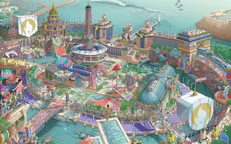
On Monday, March 4th, France unveiled the iconic posters of the Paris 2024 Games at the Musée d’Orsay.
The iconic posters are different from what people are used to seeing. With over 40,000 characters and meticulous attention to detail, they invite the viewers to immerse themselves in a vibrant and joyful world where every detail shares a unique story about the Games.
In a design world where minimalist illustrations are everywhere, this refreshing communication piece stands out for its attention to detail, engaging storytelling, creativity, and inclusive message. In my opinion, it offers many strategic insights and takeaways for branding professionals and designers.
Proven Systems for Business Owners, Marketers, and Agencies
→ Our mini-course helps you audit and refine an existing brand in 15 days, just 15 minutes a day.
→ The Ultimate Brand Building System is your step-by-step blueprint to building and scaling powerful brands from scratch.
Table of Contents
The creative vision behind the iconic posters
The iconic posters are developed by the Games’ Organizing Committee, reflecting their perspective on the event through the unique artistic approach of a selected artist, illustrator, or designer.
Paris 2024 President Tony Estanguet explained in a press release that the ambition for the 2024 Games was to create iconic posters that:
- Reflect the idea of bringing sports to the city
- Tell an impactful story about both the Olympic Games and the Paralympic Games
- Celebrate their motto, “Games wide open,” by representing the wide variety of sports and the event’s festive, moving, and universal aspects – in a way that speaks to each individual.
To create an artwork that stands out, the team worked with Ugo Gattoni, a professional illustrator specializing in colorful and detailed illustrations. The team asked him to create a fresco based on three main creative axes:
- Effervescence and the profusion of detail: Create complex and lively designs combining tiny elements and small scenes. The idea was to (1) Encourage viewers to explore this dynamic little world, uncovering fresh pieces with each look. (2) Create an overall picture that conveys a message when viewed from afar, but as you get closer, additional details emerge, revealing a pathway to various potential stories.
- Reverie and fantasy: The posters should transport the viewers to a utopian Paris. They should show a city welcoming the world, where well-known French locations, landmarks, and icons are reimagined. In this fantasy Paris and France, sports should dominate the urban landscape, with hints of the past Games of 1900 and 1924 to the contemporary setting of the 2024 Games.
- Cheerfulness and lightness: The illustrations should be festive, joyful, and colorful to reflect the desired spirit of the Games of Paris 2024.
The result: taking visual storytelling to new heights with a unique design
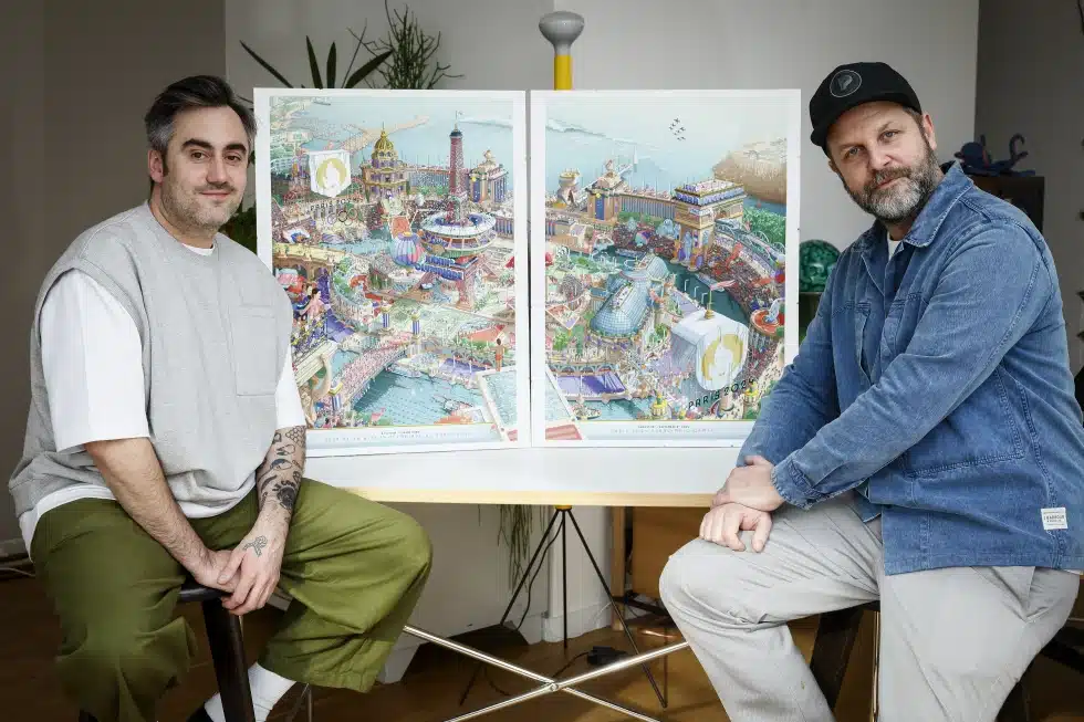
Six months of intense work later, and after spending more than 2,000 hours on the illustrations, the result translates into a diptych design, bringing together Olympism and Paralympism.
“For the first time in the history of the Summer Games, the Olympic Poster and Paralympic Poster were designed together: each one can work independently, while combining to form one seamless united image that tells the overall story of Paris 2024.”
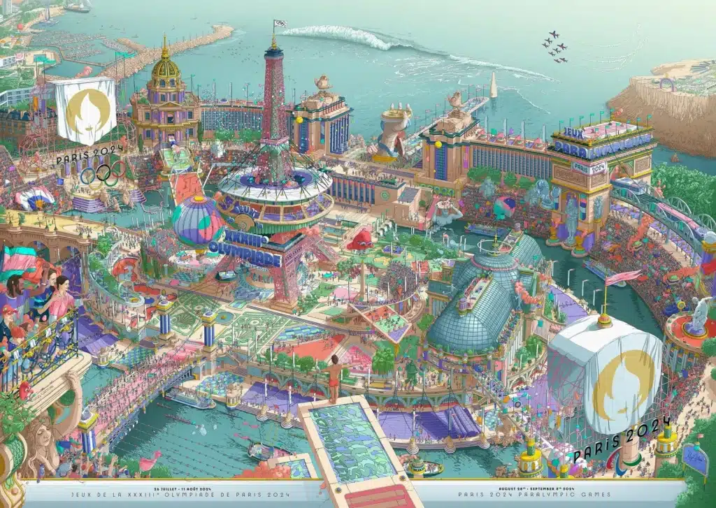
The illustrations reflect all the elements and symbols that make up the brand identity of the Games of Paris 2024:
- Symbols representing the Olympic and Paralympic games: the Olympic Rings, the Three Agitos, Stoke Mandeville, the Olympic Motto, etc.
- Signature elements of the Paris 2024 edition: the mascots, the arrival of the Olympic Flame in Marseille aboard the Belem, the Mass Event Running, the boats of the Ceremony on the Seine, Olympic equality, the iconic competition venues, etc.
- Major symbols of Paris and France: the Marianne, the Eiffel Tower, the Paris Metro, the Seine, Paris monuments, etc.
- More than 40 sports represented: including the four new ones added this year (breaking, sport climbing, skateboarding, and surfing).
The illustrations also have plenty of funny details and secret scenes, making the visual experience richer and more enjoyable to explore.
“When I was asked to design the Iconic Posters for Paris 2024, I immediately imagined a city-stadium open to the world, a suspended time in which you can wander through microcosms where Parisian monuments and sporting disciplines joyfully coexist.”
Ugo Gattoni
I invite you to explore the details by yourself by downloading the image in high resolution, reading the official presentation document of the posters, and via the below video shared on the illustrator’s Instagram profile:
Key insights and takeaways for branding professionals
This disruptive poster design particularly caught my attention because it can be an excellent source of inspiration to elevate the images people choose for their brands. There are key insights and ideas that people can draw from this example. Feel free to explore the below options for your brand.
5 ideas to enhance your brand imagery and strategy
1. Differentiate through innovation
Previous Olympic Games posters have typically embraced minimalistic designs, especially in recent years. The 2024 edition offers a valuable lesson: brands should not shy away from standing out by embracing bold and unconventional approaches.
Don’t hesitate to explore innovative strategies in your brand imagery that diverge from the norm and draw attention to your brand. Of course, being unconventional can always attract some criticism, but as long as the creative approach aligns with the brand’s essence, identity and with what your target consumers enjoy, there are few risks involved. Taking calculated risks can establish your brand as an industry leader and draw attention to your unique brand story.
2. Cultivate the power of attention to detail
In a world currently dominated by minimalistic illustrations and designs, seeing a poster with so many details and micro-stories is both refreshing and inspiring. Why not explore new types of designs that have secret hidden details and tell multiple stories? It can be a great way to catch your audiences’ attention and connect with them on a deeper level.
But details can be used beyond brand imagery. Paying attention to detail in your overall brand activities can show that your brand is reliable and professional. And going the extra mile is always a powerful way to make your brand stand out by positively surprising its community.
3. Use art to improve brand loyalty
The 2024 iconic posters were displayed in a famous French museum (Musée d’Orsay) and will be available for purchase for people who want to display them in their homes. They were truly designed as a piece of art.
By elevating your brand images to the level of art, you can cultivate a sense of emotional attachment and admiration among your audience, turning your visuals into not just representations but masterpieces that they can appreciate and cherish over time. This is an interesting approach to foster brand loyalty. Why not collaborate with local talented artists, illustrators, or designers to bring a fresh perspective and unique artistic approach to your brand imagery?
4. Transform passive viewers into active participants
The creative concept behind the poster is to play with it, somewhat akin to the book “Where’s Wally?”. It serves as an invitation to our inner child, encouraging exploration and engagement with the image by delving into the micro-stories.
By crafting brand imagery that invites interaction, engagement, and exploration, you can transform the viewing experience into an immersive journey, enhancing the brand experience and connection to the brand
5. Use symbolism to nurture brand associations
The illustrations feature many symbols associated with the Games and their 2024 location: symbols representing the Olympic and Paralympic games, over 40 sports, French landmarks and locations, as well as signature elements of the Paris 2024 edition. Moreover, the ability to combine the Olympic and Paralympic posters into a single unified image conveys a strong message of unicity and inclusivity.
Your brand embodies specific values and possesses a distinct story. You can explore incorporating symbols that reflect your brand’s values and identity. Symbols have the power to reinforce brand associations and emotional connections with your audience, establishing a coherent brand image.
Practical applications
How can we turn these ideas into action? Next time you create a visual campaign or communication for your brand, ask yourself the questions below. They might take your brand imagery to new horizons and spark a new creative adventure!
Differentiate through innovation
- Are there innovative visual art forms that remain untapped by the industry or competitors that you could use for your brand imagery?
- How can you strategically position your brand as an industry leader by taking calculated risks that align with your brand’s identity and values?
Cultivate the power of attention to detail
- How can you incorporate hidden details and stories in your brand imagery to engage your audience?
- In what ways can you pay attention to detail in all your brand activities to showcase reliability and professionalism?
- How can you go the extra mile to surprise your brand’s community pleasantly?
Use art to improve brand loyalty
- Have you considered partnering with local artists, illustrators, or designers to infuse your brand imagery with a distinct artistic flair?
- Is it feasible to produce limited editions of your products through artist collaborations that your customers will treasure for years to come?
- How can your visual communications be elevated to art forms, serving as both decor and inspiration for your audience? Consider exploring various art forms such as music, cinema, documentary filming, photography, illustrations, pottery, ceramics, and more.
Transform passive viewers into active participants
- How can you create visuals and activities that invite interaction, engagement, and exploration to enhance the brand experience?
- In what ways can you turn the viewing experience into an immersive journey that fosters a deeper connection with your brand?
Use symbolism to nurture brand associations
- Are there relevant symbols that align with your brand values and identity and could be incorporated into your imagery? You can think of brand mascots or symbols representing the brand’s location, values, story, and community.
- How can you leverage symbols to strengthen brand associations and emotional connections with your audience, creating a coherent brand image?
One important thing to remember when crafting images for your brand is to evoke emotions that resonate with your target audience and align with their way of seeing the world. In addition, keep in mind that consistency is key in maintaining a coherent visual identity that aligns with your brand’s values and identity.
While experimenting with different formats and creative techniques can be exciting, remember that your audience should still be able to identify your brand through the visuals, ensuring they integrate into your brand’s overall narrative.
What are some of your favorite examples of powerful brand imagery that have left a lasting impression on you?
References
- Paris 2024. (n.d.). Paris 2024 – Paris 2024 Iconic Posters. [online] Available at: https://www.paris2024.org/en/iconic-posters/ [Accessed 3 Apr. 2024]. ↩︎
- Press.paris2024.org. (n.d.). PDF – The Iconic Posters of the Paris 2024 Games. [online] Available at: https://press.paris2024.org/assets/the-iconic-posters-of-paris-2024-494d-7578a.html [Accessed 3 Apr. 2024]. ↩︎


