An odd title, to be sure.
After all, what does branding have to do with manhole covers?
Branding, like virtually all other disciplines, can impart lessons that are cross-functional, transcending the entire realm of marketing into something much more utilitarian. Of course, the opposite is also true, with advancements in technology, psychology, and language inevitably trickling their way into brands.
But, again, what does all that have to do with manhole covers? What lessons can be learned from what is effectively a large iron lid that can be applied to brand?
Strap in, dear reader, and we’ll share a few practical lessons that should be part of the foundation of your next brand.
Proven Systems for Business Owners, Marketers, and Agencies
→ Our mini-course helps you audit and refine an existing brand in 15 days, just 15 minutes a day.
→ The Ultimate Brand Building System is your step-by-step blueprint to building and scaling powerful brands from scratch.
Table of Contents
The Lesson of Form: Design with Purpose

Microsoft was known for allegedly asking of their prospective hires during the interview process, “Why are manhole covers round?” Undoubtedly, a question that a candidate at a preeminent tech company likely wouldn’t know the answer to, so the point was to gauge the candidate’s reasoning skill because many of the reasons are quite logical, once you think about it.
Firstly, round things are easier to move—there’s a very good reason wheels aren’t square. Beyond that, there’s an element of safety and practicality. The cover sits on a lip around a manhole, and because the circular cover is the same width throughout, it can never fall into the manhole, whereas a square cover could be rotated and dropped in diagonally.
In addition, manholes—much like the name implies: man-made holes—typically require that the holes be created by machinery. Things such as drills that make circular holes. For that reason, having a circular cover simply makes more sense. It obviously doesn’t hurt that a circle will have a smaller surface area than a square cover with the same width, so they’re also cheaper to produce.
Key Takeaway #1: Keep Your Designs Simple and Useful
Tying those concepts back to the brand isn’t exactly a stretch. Just like round manhole covers are designed for practicality and safety, your branding should also prioritize simplicity and usefulness.
Take a logo design, for example. If someone is creating a logo for a company that is, say, an airline, and they know that logo will be emblazoned on the side of airplanes, designing something horizontal (as opposed to square or vertical) makes the most sense since that most closely fits the application—much like a round cover best fits a round hole. When creating a logo or any design element, think about how it will be used in real life. A straightforward design can often be the most effective.
You’ve undoubtedly heard of Occam’s Razor, the principle that the simplest answer is often the correct one. And that principle fits manholes just as well as it fits within branding.
But we’re not done yet! Manhole covers have more lessons to teach us!
The Lesson of Optimization: Use Your Space Wisely

The first manhole covers were utilitarian at the most basic level: a lid. That was it, plain and simple, a cover for a hole to—hopefully—keep something or someone from falling in. They were made of plain wood or stone.
It wasn’t long before manufacturers and city planners realized these covers could convey important information. At first, they were stamped (or carved) with the manufacturer’s information. Soon thereafter, they also included information on who was responsible for that particular area’s maintenance—a practice that continues today.
Functional elements were also incorporated. In some places, like Nashua, New Hampshire, triangular covers are used to point in the direction of waterflow. In Seattle, many covers feature city maps. Patterns have been added to reduce noise when cars drive over them, and to increase traction in inclement weather for pedestrians.
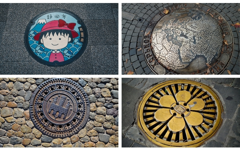
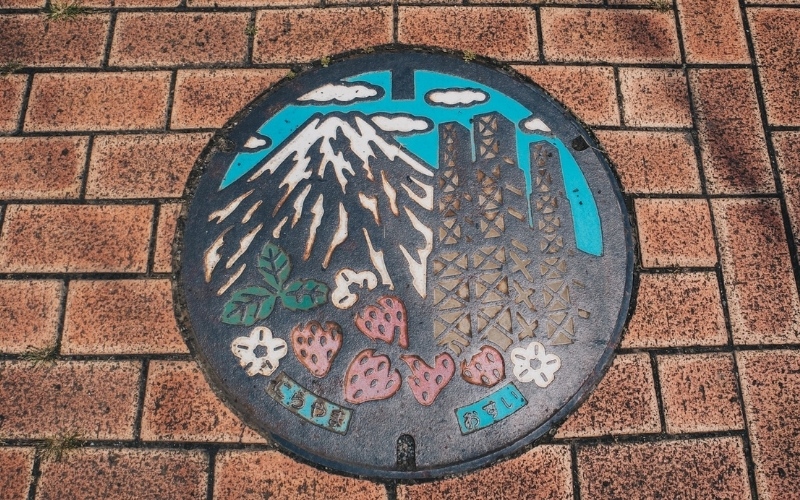
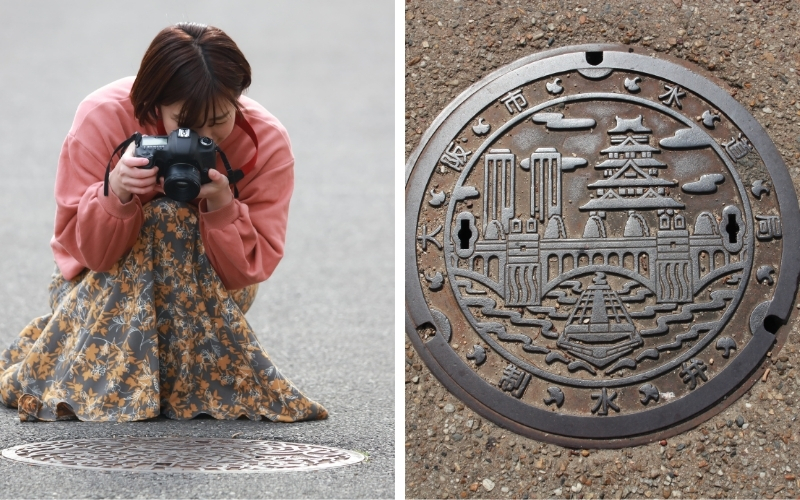
Of course, this also created the opportunity for aesthetics. Japan famously decorates its manhole covers. Even this started for functional purposes—as a campaign to raise awareness of subsurface utilities at a time when roughly only half of Japanese households were connected to municipal sewers. It has since evolved into a celebration of local culture, featuring everything from Hello Kitty to traditional folklore, often created by local artists.
Key Takeaway #2: Creatively Leverage Your Space
Manhole covers can provide important information and even add beauty to a city. Similarly, your brand has opportunities to make a statement in unexpected places. Don’t overlook any area– whether it’s product packaging, digital platforms, or the literal ground under your feet. Use this space to your advantage—where you can showcase who you are and why you matter.
Key Takeaway #3: Combine Functionality with Style
A well-designed manhole cover is not just attractive; it serves a purpose too. Your brand should aim for the same balance. Try to create designs that are both functional and visually appealing. When you blend creativity with practicality, your brand will leave a lasting impression on your audience.

In the end, branding, much like the humble manhole cover, is about more than just “covering” the basics. It’s about functionality, safety, clarity, and even beauty. It’s about making a mark, providing direction, and sometimes, adding a touch of art to the everyday.
So next time you walk over a manhole cover, take a moment to appreciate its design—and think about the lessons it might offer for your brand. After all, inspiration can be found in the most unexpected places, even underfoot.


Hello Bruno,
nice text and interesting Topic in general. Thank you.
I would like to share with you the largest collection of manhole covers. Maybe you like? Drop me your opinion.
If links not permitted, sorry for disturbing you.
https://opensea.io/collection/manhole-covers-alias-gullydeckel