“Perception” is not a very conscious process.
Think of our brains like AI on steroids. We process an infinite number of signals instantaneously and without even realizing it. What results is a picture that represents how we think about things, feel about things, and relate to things.
Your brand sends a plethora of signals that your audience uses to form a perception of who you are. Think of these subtle and intangible signals as your brand’s body language. They have the power to communicate in a way that can entirely impact brand sentiment. These intangible subtleties create the associations consumers have with our brands.
One of the core, if not the core, source of these signals is your website. Your website is your brand’s digital home, and its design can send powerful signals in ways you might not have expected.
Let’s explore some of the more subtle yet incredibly impactful ways your site design communicates with your audience.
Proven Systems for Business Owners, Marketers, and Agencies
→ Our mini-course helps you audit and refine an existing brand in 15 days, just 15 minutes a day.
→ The Ultimate Brand Building System is your step-by-step blueprint to building and scaling powerful brands from scratch.
Table of Contents
The Fundamentals of Website Design and Brand Perception
Websites have come to function as the agent or the representative of a brand’s entire online existence. On top of that, it’s one of the only places across the web where you can entirely control the narrative. So, getting the design of your website to send the right signals is of the utmost importance.
Website basics and core elements
To start, let’s better understand what we mean by website design.
There are fundamental elements that comprise the visual language of your website. Among them are:
- Color scheme – From graphics to buttons and beyond, this is the palette of colors you’ll use throughout the website
- Typography – Your site’s typography is essentially how you design the text, including font style, size, etc.
- Layout – The layout of your website refers to how you arrange and display all of the elements, from the header and footer of a page to how you present the content itself.
- Site structure & navigation – This refers to how you organize the various pages on your website (think URL structure) and includes how users will be able to move from page to page across a site.
Each of these elements can induce emotional responses among your audience without them consciously realizing it. In this way, these elements act as your site’s digital body language.
That makes getting them right foundationally crucial for your brand’s perception.
Website Design: Two Basic Principles for Brand Perception Before Going Deeper
There are endless tips and best practices I could offer you about getting the core of web design right.
For now, let’s focus on two core fundamentals:
1. Give the audience space
If your site is filled to the brim or cluttered, it can come off as if you’re not giving your audience enough space. Think of it like working in a place that is a total mess – it’s hard to think (and feel) with clarity. Alternatively, it might make your audience feel like you’re pressing too hard.
In either case, your audience may feel like they don’t have mental and emotional autonomy. Leaving enough white space on your site is the digital equivalent of the sound of silence. It speaks volumes.
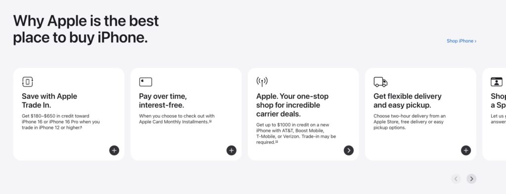
Apple’s more minimalist design language aligns with the “sleekness” of the brand overall and has the added value of giving the user some breathing room.
2. Align your design scheme correctly
Make sure your site’s overall framework aligns with your vertical (and its audience). Think about the life context of your audience. What sort of emotional framework are they operating out of? If the site’s design doesn’t align with that overarching framework, your design language won’t send the right signals. Worse, it might send the wrong ones.
By way of a hyperbolic example, if your audience is hyper-aggressive stock brokers (to borrow a stereotype) and your site’s color palette is soft, warm, and cuddly with all sorts of pastel purples and pinks, you might be signaling that you don’t understand their mindset. You’ll be potentially saying in a very unconscious way, “We don’t understand you.”
The Deeper Signals Website Design Sends
There’s a lot to consider when implementing a website design that sends the right brand signals. To really create the sentiment you desire, your website should consider aspects of design that go beyond the basics.
At first glance, elements like interactivity, content groupings, etc., may not seem like aspects of site design that communicate who and what your brand is all about. However, these facets of website design can deeply influence how your audience sees you and feels about you.
The Subtle Signals UX Can Send
Your website’s User Experience (UX) refers to how visitors interact with your site and its content. For example, clicking on a button on the site that says “blog” and having it take them to your About page (i.e., not your blog) would be a poor user experience.
While there are a substantial amount of “UX fundamentals” to discuss, I want to hit on three ways your site’s UX deeply communicates with your audience that you may not have considered:
1. Your site’s level of interactivity
Everything you say and do communicates something to your audience. Equally, how you say and do these things communicates a lot about you. In line with that thinking, how richly and complexly interactive your site is communicates something very subtly (yet powerfully) to your audience. And it’s not something people generally think about from a brand design point of view.
Imagine your entire offering’s positioning was centered around offering efficiency and simplicity to your consumer. An overly complex site experience (like many scroll animation sites employ) can send the opposite message to your audience.
The inverse is also true. If your positioning is around complexity and sophistication, a more immersive experience may work to your advantage.
Scroll animation can be incredibly engaging and add a layer of sophistication, but it can also make navigation more complex.
Depending on what your brand does and offers, you may or may not want to send that signal. Either way, the level of site interaction complexity is something to consider and align with.
2. Content prioritization
What you say on your site, when you say it, and how prominent and easily accessible it is speaks volumes. When structuring your site you should emphasize content that reinforces who you are (i.e., your brand identity) and that offers value to your audience.
Practically speaking, that means:
- Your core messaging should be above the fold. Don’t ask your users to scroll or click anything in order to access your core messaging. Also, avoid overwhelming the user above the fold (you can always add a button to move the user to longer content experiences).
- Trying to strike a balance when deciding on the content experience on the homepage (in particular). If your site’s initial experience only (or overly) emphasizes transactional copy, you could be subtly posturing in an overly aggressive manner that produces some negative sentiment. At the same time, you’re not offering your audience the opportunity to learn who you are and trust you.
Showcasing entry points to things like your educational content, testimonials, or even your About Page early on can help your site send the right trust signals. This is especially true if your site deals with Your Money Your Life topics like health and finance (i.e., topics that impact your audience’s health, well-being, and security).
Beyond this, how you construct and prioritize the content experience of your site can help you effectively reinforce your identity and value. It can even gently introduce your audience to the notion that your brand is expanding or pivoting.
Prioritizing access to your site to topics that extend your current offering or pivot from it can signal that your brand is evolving. This can be done by showcasing blog posts related to these new topics on your homepage or pinning such posts to the top of your blog, etc.
3. Content and Site Structure
Some more “structural” UX elements that you’ll want to ensure you consider include:
- Menu structure – How you structure your site’s menu can be a great opportunity to foster awareness of your offering and identity. If you overload the main menu, it may make it difficult to do so. Go lean with the top-level menu and use the sub-menu as a way to present more specific options to your users.
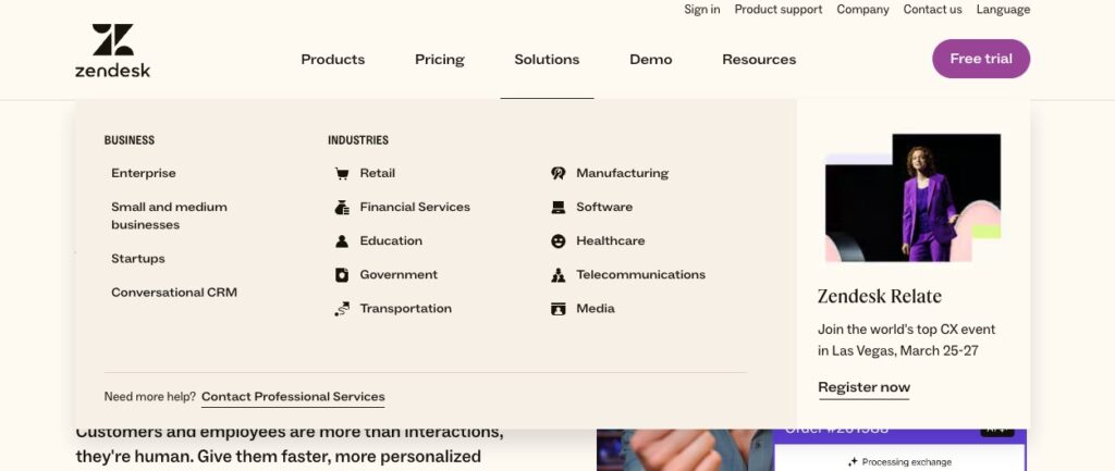
Zendesk keeps its top-level menu straightforward and relies on a sub-menu to showcase its full offering.
- Ease of page-to-page navigation – Beyond the menu itself, you’ll want to make it easy to move from one page to the next. This can be done with properly placed CTAs, internal linking, etc. Not making this process seamless can make your site a frustrating experience for users. It can also send the signal that you are not efficient, focused, and competent.
- Click depth – You don’t want users to have to click too many times in order to access content that is important to them. If a user has to execute five clicks to get to a page on the site they’re energetically interested in, that can be frustrating. It can also signal that you are out of sync as to what is important to them.
- Content organization – Is your content structured in a way that portrays you as a topical authority? Does it reflect the topical diversity your brand deals with? Does it present the multiple layers of content your site offers?
At the intersection of UX and content, strategy is how you decide to pair and connect the different pieces of content on the site. It can be a powerful tool if done correctly. Things like content carousels on the homepage, related post elements on your blog, and the linking you do from one page to another should be strategic. If you want to showcase deep authority, ensure your more substantial pieces of content are shown together in a distinct visual manner. If you want to indicate you offer a wide topical breadth of content, then ensure those topics are all present together in high visibility areas on the site.
For example, on the Wix SEO Learning Hub, I wanted a more visual way to indicate that our content offerings go beyond text-centric articles. To do that, we created a header box that reflects the multiple layers of content assets the hub offers (and that allows the user to make distinctly visual entry points to those assets).

The Wix SEO Learning Hub utilizes a highly visual content navigation method to purposefully create the perception that it is an immersive topical experience.
The User Interface: Go Beyond Color Schemes
I want to briefly discuss a commonly ignored subtle signal that your site’s User Interface (UI) can send. Similar to the experience your users have navigating through your site (as mentioned earlier), the complexity of the look and feel per se can also send a subtly powerful message about your brand.
For the record, the UI refers to the visual representation of the site. As opposed to the UX, it’s how the site is seen and felt (as opposed to navigated) by the users and includes anything from the color scheme to the visuals your site employs.
We spoke earlier about the advantages of having a UI that leaves enough dead space to make your audience feel like they have room to breathe. At the same time, we mentioned that having a visual structure for your site that aligns with your audience’s mindset should be considered. Similarly, it should align with your brand’s identity and convey a sense of professionalism. There is, however, one last point about your UI I felt compelled to touch on – the complexity of it.
Like not having enough white space, an overly complex site design can leave your audience feeling “overwhelmed.” While it’s increasingly common to see an overabundance of animations and large (exceedingly large) visual elements, you should exercise a degree of caution.
While such elements can be “fun” you should think about how they all compound. When presented as a whole, do they give the site an overly complex or “in your face” feel? This might be especially problematic if your product or service is more holistic in nature. That doesn’t mean you can’t go with such a presentation, it just means you should keep that subtle signal in mind when designing your site.
Take the site below, it’s positioning its product as being easy to use and simple. Would a complex presentation align and produce the desired sentiment in such a case? Probably not.
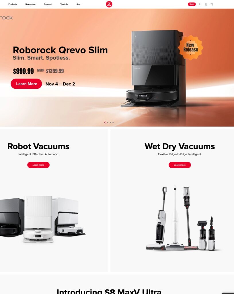
Roborock entices its consumers with a product that is simple to operate while employing a very straightforward design scheme that aligns.
How To Get Website Design Signal Right From the Get-Go
Revamping your entire site’s visual language is both costly and time-consuming (let alone stressful). Getting the signals embedded in your website design right from the start is important. It’s far easier to revise and adjust along the way without having to fundamentally fix your site’s design.
There is one universal that I’ve seen across sites that get the underlying communications side of site design right, and that’s their mindset.
If you can adopt a mindset that considers the subtle signals your site design sends, you’re ahead of the game.
There are a few things, I find, this mindset includes:
- Appreciating your brand’s identity and positioning. Let having a deep appreciation for who you are as a brand, what you represent, and how you present and position that to your audience be your guide.
- Genuinely prioritizing the audience’s life context and needs. Creating a site design that considers the “below the surface” signals is all about connecting with the emotional framework your audience is operating out of.
- Having a hyper-sensitivity to the unseen signals you’re sending. There’s no substitute for tapping into the nuance of what’s implied by your site design.
For some, the sensitivity mentioned above comes naturally. For some, it does not.
If it doesn’t, the first thing you’ll want to do is to concretely define your audience. But don’t only define who they are. Also, define their emotional needs in the context of what you offer. Understand their outlook and what deeply-seated emotional problems they are trying to solve for themselves.
With that understanding, you can better analyze your site’s design and the elements it includes from your audience’s point of view. Take what you’ve defined and literally ask yourself how your audience would feel about each facet of your site’s design.
Keeping Your Website Design in Tune Over Time
Good site design is about balance. There are multiple priorities to consider when designing a website. From website performance (i.e., load times, etc.) to conversion rates to user sentiment and beyond, there is a lot to balance.
Know that there is no perfect balance.
You’ll find that at certain times, you might need to sacrifice how fast the page loads for the sake of conversions or brand signals and vice versa. These sorts of compromises along the way are par for the course, but they’re also often hard decisions to make. It’s natural to revisit them from time to time.
At the same time, your site design should evolve as you do. If your business strategy changes, maybe your site design needs to be updated to align better. If your audience or their needs evolve, so should your site’s design. Etc.
For these reasons (and more), don’t look at site design as a one-time thing. Build revisiting site design into your planning process. In this way, your site design becomes a living and breathing part of who you are and your marketing strategy.


