The Downtown Ontario Improvement Association (DOIA) is a non-profit organization. Its members include business owners, developers, and stakeholders who work together to revitalize, beautify, and keep Downtown Ontario safe. Their goal is to attract visitors, investors, and new residents. Formed in 2019, they have invested significant effort and resources into the revival of Downtown Ontario.
With all the hard work being put into restructuring and rebuilding the area, DOIA sought to rebrand Downtown Ontario to reverse its negative reputation from the past 30 years. The goal was for their brand to reflect their vision accurately.
Proven Systems for Business Owners, Marketers, and Agencies
→ Our mini-course helps you audit and refine an existing brand in 15 days, just 15 minutes a day.
→ The Ultimate Brand Building System is your step-by-step blueprint to building and scaling powerful brands from scratch.
Table of Contents
About The Brand
Downtown Ontario, California, has been known as the cradle of innovation and growth in Southern California since its founding in 1881. Nestled in the foothills of the San Antonio Mountains, it thrived from the 1950s to the 1990s, drawing visitors to its stores, restaurants, and theater.
The Downtown is characterized by the well-known Euclid Median, which runs down Euclid Avenue, starting in Ontario and passing through its neighbor, Upland. The median has hosted events like the All-States Picnic, which once drew over 120,000 people to picnic under the pepper trees and is home to life-sized Nativity scenes displayed during Christmas—a long-standing tradition.
Sadly, this significant piece of California’s history fell into disarray following the construction of a mall in a neighboring city and the recession in the early 2000’s2000s that quickly followed. Ontario’s once-distinct downtown became a corridor of shuttered businesses, a hotspot for vandalism, and streets littered with trash.
Having lived in Upland as a child, I was familiar with Downtown Ontario, more specifically- its reputation.
If you lived north of Ontario, it was common to hear, “Don’t go below the 10, or you’ll hit Ontario!”—a reference to the bridge over the 10 Freeway that separates the two cities.
The Rebranding Journey: How It All Began
The context
Having been awarded 35 million to revitalize Ontario, the city encouraged the newly formed DOIA to up its marketing and branding efforts. They began by adding a dedicated police patrol and offered grants to new businesses relocating to the downtown area.
DOIA organized events, started an official social media presence, and began to invest in street banners. However, residents remained apprehensive and were not showing up as Downtown Ontario still had the reputation of not being the safest or cleanest area in which to spend time.
“What do you think we can improve on?” was the first question the Executive Director asked, to which I replied, “Can I be honest?”
I told the director about my first impression. “I can see all the changes. You guys have put in a lot of work, and the downtown area is unrecognizable from 10 years ago! But… there’s no personality, which is a shame because this Downtown is historic. Personality is the one thing it should showcase. You have to show the residents why they should come. And you being a new organization, this is a great opportunity!”
After further discussion, the contract was signed, and my team and I got to work.
The branding challenges
I wasn’t lying when I told the director all of that. It wasn’t a sales pitch; I truly meant it.
After a quick overview of the Downtown, I could pinpoint some of its problems:
— Although the association had put up new banners, they were generic
— The posters in businesses and the visitor pamphlets could have been more inspired
— While DOIA emphasized a vibrant Downtown Ontario, their assets were not on the same page
That was only visually, our team still had to collect the locals’ feelings towards the Downtown in order to address the issues.
Part 1: The Research
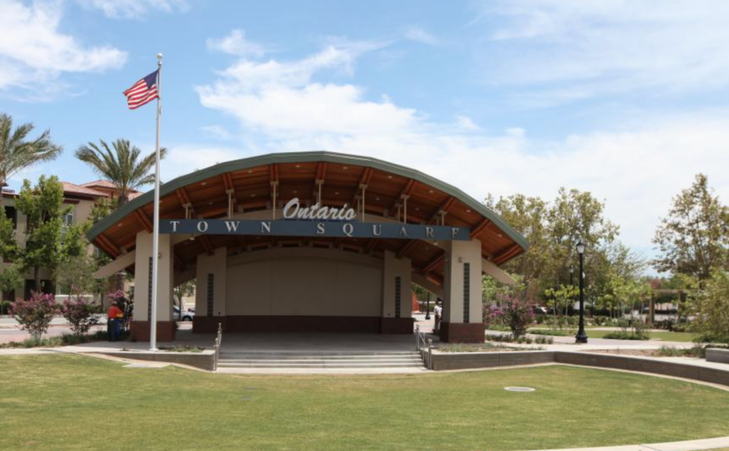
Our method of gaining information was very organic. We decided to immerse ourselves in Downtown Ontario—eating at restaurants, speaking to business owners, and attending organized events.
While at these events, we began engaging with the locals, leading with questions such as “Have you seen all the changes in the downtown?” “What do you hope they implement?” “What’s your favorite place?”
We conducted polls online, became more active on social media, and combed through all the comments. Our goal was to narrow down the target market and, subsequently, think like a local. Our approach was subtle: while on the field, we avoided any mention of rebranding to encourage honest, candid conversations.
We noticed that the tone often shifted when the association or city was mentioned. When it came to the business owners, a significant part of the non-profit, we honed down on pain points. What had they heard from their customers? What were the most common complaints?
“There’s nothing to do here” was the most resounding feedback, followed by “So many mom-and-pop shops are gone”.
Given that the city had been courting new businesses, we met with them. There was a new home goods store opening, a restaurant under construction in a former bank building, a café that had opened a year prior and was thriving, and many other small businesses beginning to spring up.
We finished our research with a mandatory visit to the Ontario Museum of History and Art. The museum, also in need of more foot traffic, proved to be a great source of information. We learned the entire history of Downtown Ontario, saw what it looked like in its heyday, and how it had changed over time. It helped us grasp the essence of the city.
Part 2: The Strategy
After immersing ourselves in everything the Downtown had to offer, we crafted a branding strategy for the association.
Our cornerstone was community. We aimed to bring locals together and cultivate a sense of pride among them.
From our conversations, we noticed that most visitors to Downtown were long-time residents and young families moving away from the noisy, fast-paced environment of Los Angeles into Ontario. According to the Economic Innovation Group’s 2023 study, some of the country’s largest counties—including New York, Cook County, IL, and Los Angeles—saw their population of young children shrink by 10% compared to April 2020.
It is a well-established fact that humans have a universal need to belong, and our research solidified that this would be the best approach. We would take the rebranding of the Downtown as an opportunity to inject personality into the area, highlight its history, feature locals’ recommendations and best-kept secrets, and encourage residents to support long-standing traditions while creating new ones. Our mission was to ignite a sense of pride within the community, by creating a feeling of truly belonging to this city.
Part 3: The Implementation
Once we had solidified what was behind the rebrand, we focused on how we would implement it.
We knew from the very beginning that the new rebrand would unfold over 2 years:
- Stage 1: Explore DTO
- Stage 2: Experience DTO
New visual identity: balancing history and modernity
We began with a complete redesign of the banners, postcards, informational material, social media presence, and the overall identity of the Downtown.
Although Downtown Ontario is a historic downtown, we decided the rebrand needed to embrace the new changes coming to the community. We would incorporate the history part in our storytelling, but we wanted to keep the design itself clean, modern, and image-driven.
We aimed to show that we were aware of the history, but the Downtown was still growing and evolving with its residents.
Working with the existing logo

As we started the design process, we had to abide by the organization’s one rule- the logo could not change. Rather than resist, we chose to work with it.
Although DOIA’s logo was the definition of corporate, we took it as an opportunity to show that the organization wasn’t afraid to experiment. The logo would remain the same, while its surrounding designs would be loud, vibrant, and colorful.
Colors, typography, and graphic design layouts
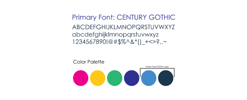
The use of hot pinks, greens, blues, and yellows could be found in the design, but it was not overpowering. The focus was the image; the colors came in the form of accents. The design was tied to the theme’s slogan (Explore DTO). The typography- coming directly from the one found in the logo- was used to balance out the designs. The chosen font was Century Gothic.

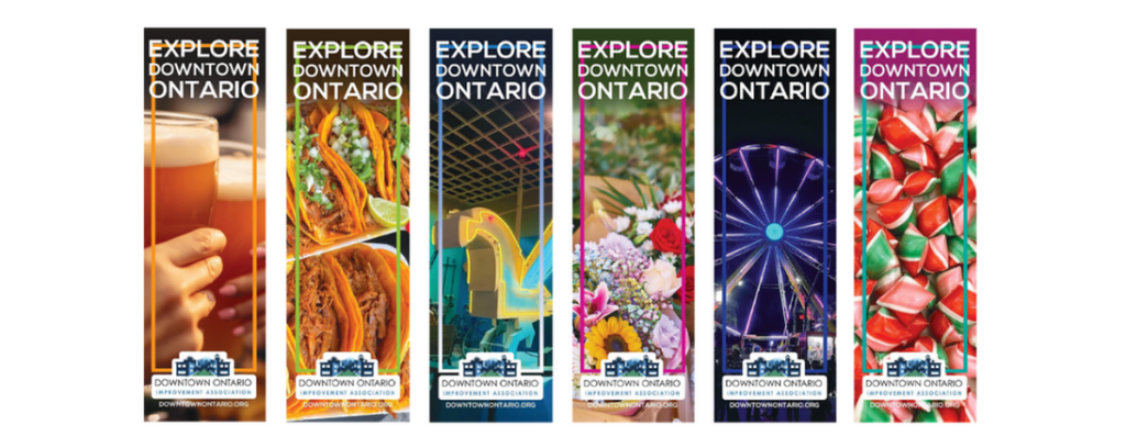
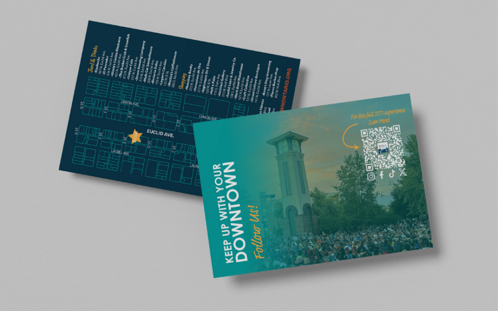
Postcards, posters, and other marketing materials followed the same guidelines, making sure that they showed rather than explained what the appeal of the DTO was.
Brand Imagery: adding a sense of community and belonging
We began by revamping the banners that lined Euclid Ave. Since Euclid is a high-traffic street, it was imperative for commuters to see the physical changes.
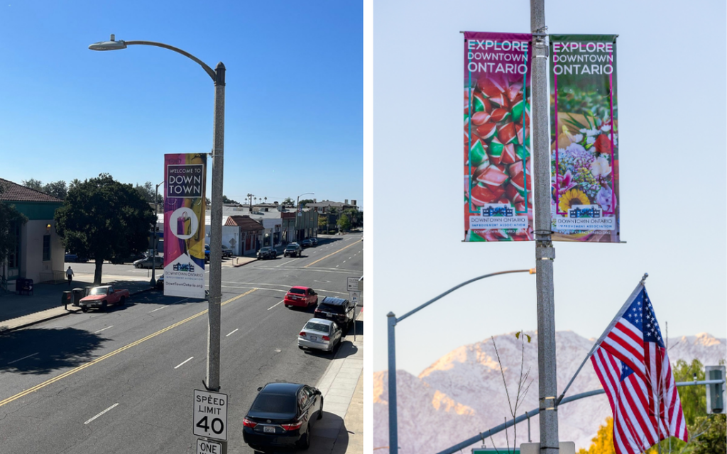
We stepped away from stock images that referenced what visitors could do, opting instead for photos taken directly in Downtown Ontario. We highlighted hidden gems from the museum that most people didn’t know were there, showcased local businesses, and celebrated crowd favorites.
We used close-ups of a restaurant’s dish to convey the message that one could dine there. To illustrate that events were happening, we included captivating images from an annual event on Euclid. To represent shops, we showcased a product from a local store. But it went beyond mere visuals; we sought to build community. For example, the event image wasn’t just of the event itself—it featured an eye-catching Ferris wheel. For non-locals, this would spark curiosity: “A Ferris wheel in Downtown? When?” But for locals, it represented the famous Ferris wheel that only appears during the Rt. 66 Cruisin’ Reunion.

In the same way, the shop featured wasn’t just any store; it was Logan’s Candy, one of the oldest candy shops in Downtown, a nod to the area’s history and serving as a beloved staple. This showcased that Downtown was not only growing but also nurturing its long-standing businesses.
Naming: introducing “DTO,” the new “Downtown Ontario”
From there we began adopting the abbreviation “DTO” instead of “Downtown Ontario”. This served two purposes: it saved space when referencing the Downtown and provided the residents with a catchy and familiar way to refer to Downtown. Not to mention, it sounded modern.
Brand communications: a new social media strategy
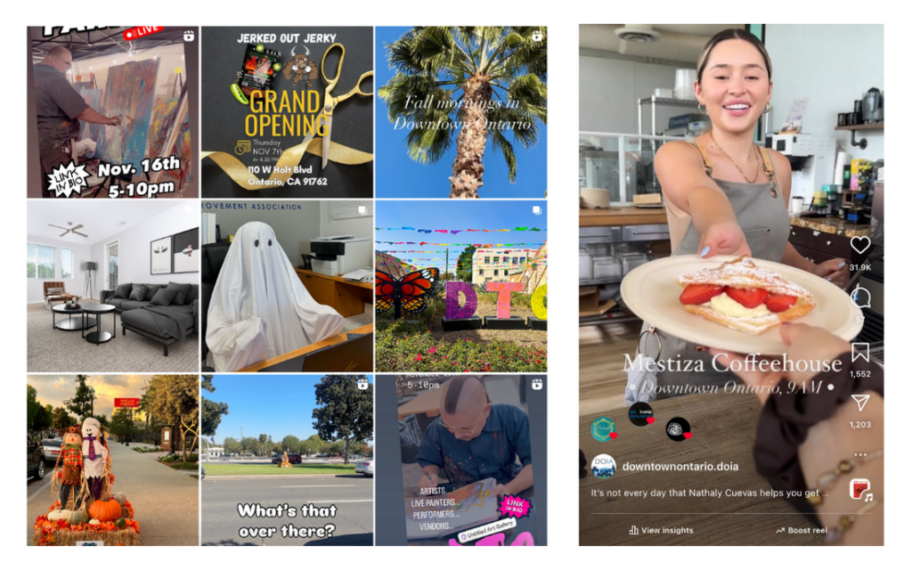
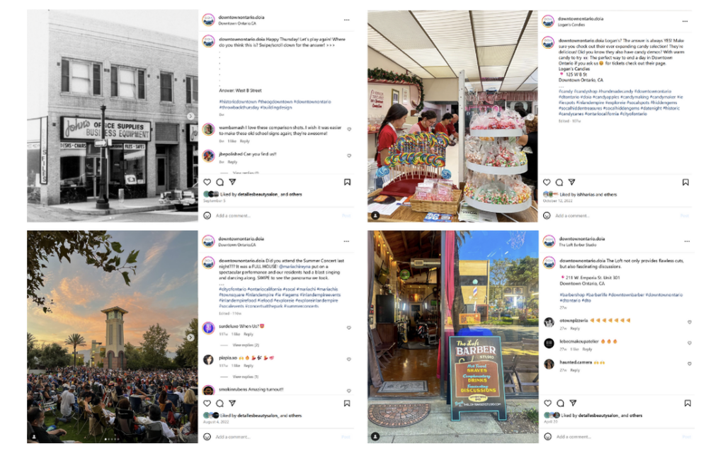
In social media, we kept an upbeat tone and encouraged our audience to engage with us. We published fun polls, organized photo challenges, and started hashtags. If any negative comments popped up, we made sure to reply to them in a positive manner.
The response time for replies to any of our socials was shortened, our aim being to become the #1 source of information on what’s happening in the area.
Overcoming pushback
We expected pushback, especially with the new acronym, but surprisingly, it was well received.
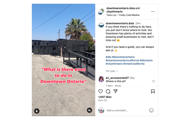
One significant pushback we experienced was people trying to push DTO’s previous reputation. The team had received many comments echoing the sentiment that there was nothing to do Downtown. I made the decision to start using them as content for our marketing materials. It worked! Our audience shifted from a negative outlook to instead asking us directly when the next event would be.
Part 4: The Results
The results of the branding project were significant and an overall success. This branding, in particular, needed to go beyond the visuals and into the community aspect.
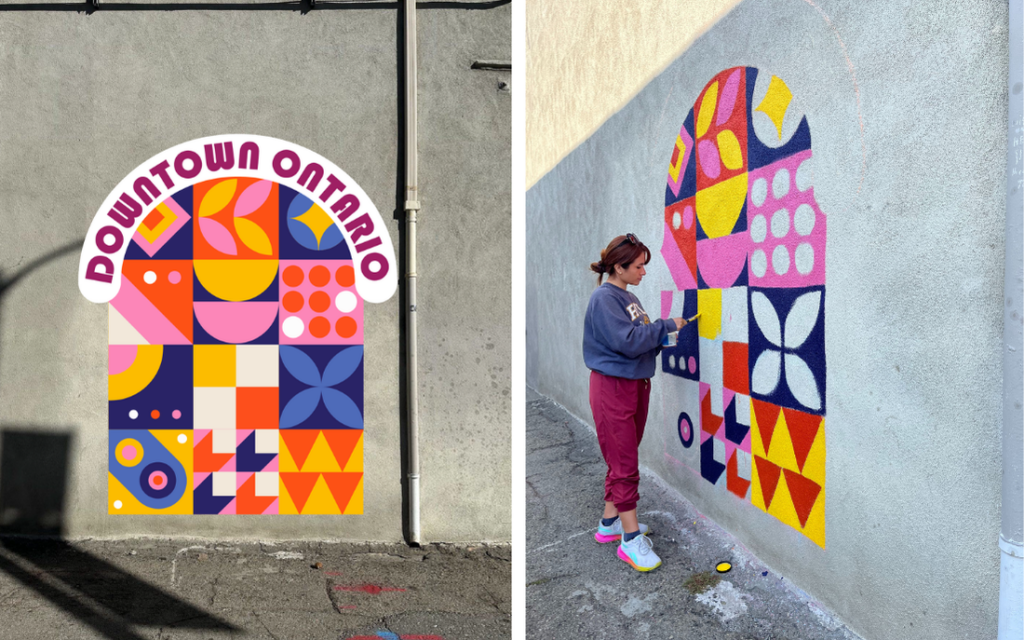
Aside from the much brighter and happier design we infused into DTO, we also initiated new events for the area that promoted the organization’s vision. The implementation of the Restaurant Crawl, AR Scavenger hunts, and even permanent photo spots in the way of murals served to incentivize the residents into starting new traditions.
“Beautiful! Can’t wait to visit!” -Mayra Ariza de Salas
“Such a fun event, can’t wait to do it again!” -Rebecca Steen in reference to the Restaurant Crawl
“I wonder what they’ll put on the banners in January” -Orfelinda Grcevic
Following the rebranding, foot traffic increased, local businesses reported a rise in customer engagement, and community events saw greater attendance. Social media metrics improved dramatically, with engagement rates skyrocketing. DOIA’s socials have the most positive comments compared to the other government accounts, such as the City of Ontario’s official accounts and Ontario’s Economic development. Our inbox sees many messages of thanks for our prompt reply, and locals will visit the director’s office to express how happy they are with the area.
A funny incident occurred when our team was in the middle of a meeting with DOIA. A resident walked into the office and exclaimed, “Who is in charge of all the banners and the Instagram?” The room fell silent, and we braced for a negative response. I raised my hand “I am.”
“You need a raise! I just wanted to tell you that you have done an excellent job! I’m so happy to be part of the Downtown, you can really see all the change. There’s so many things I’ve learned about my city thanks to you, my family goes to all the events and we can’t wait to see what’s in store! Thank you so much for bringing the community together.”
KPIs are one thing, but hearing feedback from the people affected by the rebrand is something completely different.
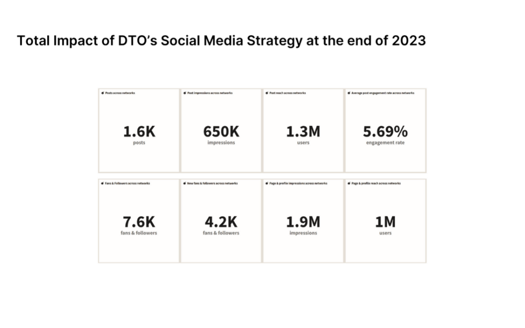
Impact over social media has almost doubled by the end of the second year, with total followers across networks being about 14.7K.
Part 5: Analysis & Key Takeaways
The rebrand of the DTO is a great example of how branding goes beyond the visual. It taps into the culture and the vision of the subject. It also shows what happens when executive and creative departments work hand in hand. We recommend ongoing efforts to maintain community involvement, as it is essential for sustaining the momentum generated by the rebranding initiative. Continued collaboration with local businesses and residents will further strengthen Downtown Ontario’s identity and foster a sense of belonging among its community members.
This rebranding project taught us invaluable lessons about the power of community engagement and the importance of preserving history while embracing change. We will definitely be taking this experience into our other projects. Here are some takeaways I’d like to share:
- Listen to your audience. You can learn so much about how to tackle a rebrand by figuring out the pain points.
- Go beyond the visual: lasting brands impact not only the company itself, but those around it.
- Don’t be scared to experiment. Our colorful palette had a chance of being deemed “too much” but the implementation allowed the residents to view the area as a happening place.
- Work with what you have. I cannot emphasize this enough. The Downtown only had about 4 restaurants when we decided to create The Crawl, so we decided to include ALL the eateries- candy shops, Starbucks, etc. It was a success, and the tickets were sold out!
The successful rebranding of Downtown Ontario stands as a testament to the resilience of communities and the importance of listening to their voices. With continued commitment to revitalization and community engagement, Downtown Ontario is poised for a bright and prosperous future.


