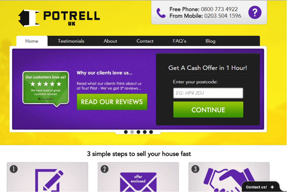
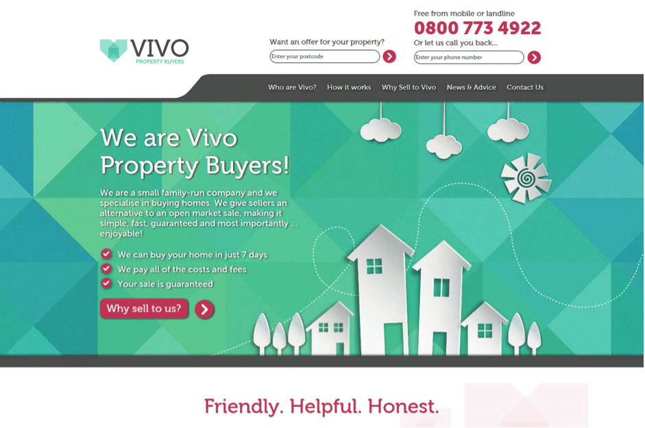
Vivo is small, family-run property company that specialises in buying homes fast. Originally known as Potrell UK, the founders decided that they needed a new name and visual brand identity that the UK market could relate to. Thus, in November 2015, Potrell became Vivo Property Buyers.
Proven Systems for Business Owners, Marketers, and Agencies
→ Our mini-course helps you audit and refine an existing brand in 15 days, just 15 minutes a day.
→ The Ultimate Brand Building System is your step-by-step blueprint to building and scaling powerful brands from scratch.
Table of Contents
About The Brand
Recognising the country’s need for a faster and more efficient way to sell their homes, Jantiene Sobry decided to create a fast property buying company in London in 2010, offering a more simple and straightforward way of selling property. Its launch was aided by Jantiene’s brother, Bart, who runs a successful property development company named Potrell BVBA in their native Belgium.
Her brother’s investment allowed Jantiene to temporarily use Potrell’s branding as the company developed. Unfortunately there was a negative stigma attached to the fast sale industry. In the past there were no rules and regulations for this particular part of the property industry and some companies took advantage of this. Thankfully, there are now more sanctions and rules in place to protect people who choose this route.
As the business grew and as Jantiene was joined by her husband Rupert, they decided it was time for Potrell to rebrand. It was time to choose a relevant name and logo which people in the UK could relate to, and to portray the trustworthy image they wanted their clients to see in their brand.
The Challenge
With this in mind, Potrell needed a new brand. One which was approachable and friendly, yet trustworthy and authoritative.
Selling your home can be a very stressful and emotional experience, so customers need a brand who can empathise with their situation. As a result, we strived for the newly branded Potrell to stand out from their more salesy competitors.
The Strategy
We ran usability testing that uncovered issues with the content on the site, this included users not understanding how Potrell can make an accurate offer without seeing the house. In addition, the testing revealed how the branding was affecting people’s perceptions of the company. One of the biggest insights was that ‘Potrell’ means nothing to people and the site wasn’t overly appealing.
We had to create a brand name that was meaningful and related to houses and living. Subsequently, we found Vivo, which is Latin for ‘to live’. Thus, Vivo Property Buyers was born.
The logo
To reflect the values of the company, we designed a clean and simple logo to instil trust in the brand. This notion is reiterated with the colour choice of teal which portrays trust and harmony.
The decision for the logo to feature a heart around a house shape depicts Vivo’s commitment to empathy and compassion, and that all homes deserve love.
The website design
The design of the site factored in Vivo’s professional and trustworthy brand image, but was also created to be modern, simple and fun with the animated paper house design.
The tone of voice & content
Our aim was to be transparent with the reader, therefore it was important to gain their trust and ensure that they felt comfortable and confident in Vivo. Subsequently, we attempted to answer any questions a user may have by creating user-focussed content – something our competitors lacked. We included pages regarding how Vivo made their money, why they can be trusted and how they can make you an accurate offer.
The Results
- Firstly, onsite engagement has improved, with average time onsite increasing by 70% (to two minutes).
- Pages per sessions by 49%.
- Most importantly for Vivo, enquiry conversion rate has almost doubled (+92%).


